Sunday, July 28, 2024

Francis Bacon: Human Presence

National Portrait Gallery -London

10 October 2024 – 19 January 2025


Study for Self-Portrait, 1963 by Francis Bacon © The Estate of Francis Bacon. All rights reserved, DACS/Artimage 2024. Photo: Prudence Cuming Associates Ltd. Amgueddfa Cymru – Museum Wales; 

Three Studies of Isabel Rawsthorne, 1967 by Francis Bacon © The Estate of Francis Bacon. All rights reserved, DACS/Artimage 2024. Photo: Prudence Cuming Associates Ltd. Neue Nationalgalerie, Berlin; 

Self-Portrait, 1987 by Francis Bacon © The Estate of Francis Bacon. All rights reserved, DACS/Artimage 2024. Photo: Prudence Cuming Associates Ltd. Private Collection, NYC. 


Francis Bacon has long been considered one of the most outstanding painters of the twentiethcentury. Best known as a figurative artist, his work transforms the appearance of his subjects through an extraordinary use of paint. Francis Bacon: Human Presence (10 October 2024 – 19 January 2025) will be the National Portrait Gallery’s first exhibition to focus on the work of this important artist, and will explore Bacon’s deep and complex engagement with portraiture – from his responses to portraits by earlier artists, to large-scale triptychs memorialising lost lovers. 

Featuring more than 50 works from private and public collections around the world, in addition to photographs of the artist, Francis Bacon: Human Presence will be organised thematically and chronologically, starting with works made in the late 1940s and closing with portraits painted at the end of his life, one of which remained unfinished on an easel in his studio. 

Through five key phases – Portraits Emerge, Beyond Appearance, Painting from the Masters, Self Portraits, and Friends and Lovers – the exhibition will chart the evolution of Bacon’s practice, exploring how he both embraced and challenged the traditional definitions of portraiture. 

Bacon’s early works feature disconcerting figures, screaming or pained, as the artist explored how to depict humanity in a post-war world. 

The exhibition will begin by introducing viewers to a selection of these early paintings, including Head VI (1949) and Study of the Human Head, (1953) works that depict anonymous male subjects. Both bear all of the visual conventions of formal portraiture. The sitters are presented in a traditional three-quarter-length format against dark backgrounds. In the case of Head VI, the figure is trapped within a transparent cage, while Study of the Human Head peers through striations and appears X-rayed, disconcertingly revealing the sitter’s skull and teeth. Bacon’s early work destabilised and the traditional understanding of portraits of powerful and successful men. 

 While he never saw 


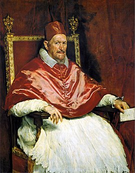
Velázquez’s Pope Innocent X (1649−50) or 


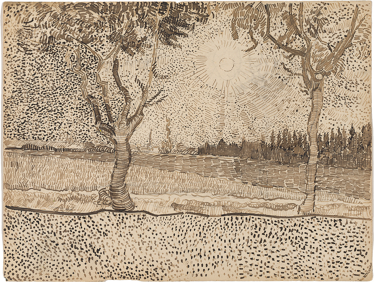
Van Gogh’s The Painter on the Road to Tarascon (1888) in person, 

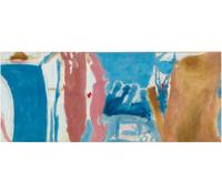
these paintings became great sources of inspiration to Bacon. From books and torn-out references that adorned his studio floor, he reimagined elements of each painting throughout his career, paying homage whilst challenging assumptions of what a portrait was and could be. Bacon’s interest in Van Gogh saw him move away from the creation of dark, monochromatic images, opting to introduce colour, which would characterise his future work.

Study for a Pope I, 1961 by Francis Bacon © The Estate of Francis Bacon. All rights reserved, DACS/Artimage. Photo: Sotheby's. c/o Cingilli Collection; 

Homage to Van Gogh, 1960 by Francis Bacon © The Estate of Francis Bacon. All rights reserved. DACS 2024. Gothenburg Museum of Art. 

By the mid 1950s, Bacon had moved away from painting screaming figures, but continued to paint ambiguous and unsettling images. Choosing – for the first time – to paint from life, he made portraits of his patrons, Robert and Lisa Sainsbury, and his friend and fellow artist, Lucian Freud, displayed in a section of the exhibition called Beyond Appearance. However, Bacon did not overly enjoy the process of painting from life, which he found to be inhibiting. While he valued qualities of immediacy in the application of paint, Bacon began to frequently distance himself from his subjects in the studio, choosing instead to paint from photographs and memory. This approach allowed him the freedom to ‘distort’ and protect his sitters from any perceived ‘injury’ that he knew he could inflict through his interpretation. Gifted a model of an 1823 life-mask of the poet and artist William Blake, bought from the National Portrait Gallery’s Shop, Bacon also painted a portrait based on this historic object, which fascinated him. 

Another ‘Master’ revered by Bacon was Rembrandt, who he admired for his ‘anti-illustrational’ painting style. Bacon studied the brushstrokes that made 


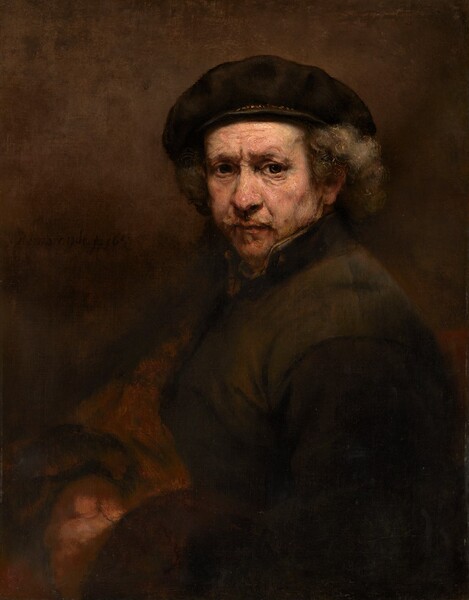
Rembrandt’s Self-Portrait with Beret (1659) while staying in France, and coveted several printed reproductions of the portrait in his London-based studio. Displayed as part of the Painting from the Masters, the National Portrait Gallery exhibition will provide an opportunity to see Rembrandt’s Self-Portrait with Beret alongside Bacon’s own work, presented as a key painting in his development as an artist. 

Like Rembrandt, Bacon returned to self-portraiture throughout his career, painting himself over 50 times during the decades of his life, from small single heads to full-lengths and large triptychs. 

Other artists were also drawn to depict Bacon, particularly photographers, for whom he sat throughout his career. The exhibition includes photographic portraits and film of Bacon by some of the century’s leading photographers, including Cecil Beaton, Arnold Newman, Bill Brandt and Mayotte Magnus. 

Some of Bacon’s most poignant and introspective self-portraits were undertaken shortly after the deaths of the people closest to him. When his long-term partner Peter Lacy died in 1962, Bacon responded with a small triptych of portraits that memorialised their relationship. A decade later, Bacon lost his lover George Dyer, another potent presence in so many of his paintings. Dyer’s death seems to have compelled Bacon to make a remarkable group of self-portraits, including Self-Portrait, 1973 (1973), which – capturing his grief and isolation – became a way to reckon with his own mortality.

Head of Boy, 1960 by Francis Bacon; © The Estate of Francis Bacon. All rights reserved, DACS/Artimage 2024. Photo: Prudence Cuming Associates Ltd. Private Collection; NPG x13707, 


Self-Portrait, 1973, 1973 by Francis Bacon © The Estate of Francis Bacon. All rights reserved, DACS/Artimage 2024. Photo: Prudence Cuming Associates Ltd. Private Collection; NPG x138805, 

 As Bacon’s work evolved in the 1960s, his portraits became more personal and focused on a select coterie of sitters. At the heart of Francis Bacon: Human Presence are the artist’s paintings of friends and lovers, who inspired him throughout his life. Transcending likeness, Bacon’s portraits represent some of his closest relationships – including his partner, Peter Lacy; his lover, George Dyer; his partner in later life, John Edwards; his friend, Henrietta Moraes; the founder of the Colony Club, Muriel Belcher; and his friends and fellow artists, Lucian Freud and Isabel Rawsthorne. These clusters of portraits allude to Bacon’s biography – his sociability and tumultuous relationships – but also speak to his acute sensitivity to despair, grief and pain. 

While Bacon chose not to paint his sitters from life, he acknowledged that he could not paint them unless he knew them very well. These paintings are perhaps his most intimate and personal, despite their distortion. He preferred to work from photographs, sometimes torn and crumpled, which he had commissioned from the former Vogue photographer, John Deakin, some of which are included in this exhibition. 


 Portrait of a Man Walking Down Steps, 1972 by Francis Bacon © The Estate of Francis Bacon. All rights reserved, DACS/Artimage 2024. Photo: Prudence Cuming Associates Ltd. Private Collection; 


Henrietta Moraes, 1966 by Francis Bacon © The Estate of Francis Bacon. All rights reserved, DACS/Artimage 2024. Photo: Prudence Cuming Associates Ltd. Private Collection. 

“Francis Bacon was deeply engaged with portraiture, challenging long-established expectations of what a portrait should entail. For him, it was the pre-eminent painting genre, capable of expressing what it meant to be human. As one of the greatest British painters of the last century, I’m delighted to bringing so many of Bacon’s works to the National Portrait Gallery for the first time, as we stage London’s first ever exhibition dedicated to his many portraits, fusing image and paint in a truly unique way.”

The exhibition publication Francis Bacon: Human Presence, written by curator Rosie Broadley, will be available from October 2024, with essays by art historian, Richard Calvocoressi; author and art historian, James Hall; art historian and Francis Bacon specialist, Martin Harrison; curator at Tate Britain, Carol Jacobi; archivist of The Estate of Francis Bacon, Sophie Pretorius; associate professor of art history at the University of Birmingham, Dr Gregory Salter; contemporary curator at the National Portrait Gallery, Tanya Bentley; assistant curator of photography at the National Portrait Gallery, Georgia Atienza; and filmmaker and director, John Maybury, whose Love Is the Devil: Study for a Portrait of Francis Bacon starred Sir Derek Jacobi, Daniel Craig, and Tilda Swinton. 


Helen Frankenthaler: Painting on Paper, 1990–2002


Gagosian has announced Helen Frankenthaler: Painting on Paper, 1990–2002, an exhibition opening at the gallery in Rome on September 30, 2024. It features eighteen large-scale paintings on paper from the later part of Frankenthaler’s career, many of which have never before been exhibited.

Helen Frankenthaler (1928–2011) was one of the most highly regarded American artists of her time. Over her last decade of art making, painting on paper became Frankenthaler’s primary means of expression. “I’ve always worked on paper,” she noted in 1996, “but not conceived on the scale of my canvases. . . . The shift was a tremendous move for me.” The paintings in the exhibition reveal her exploration of the material and compositional possibilities of working on paper: new kinds of chromatic juxtapositions and painterly gestures, often set down on a smoother surface than canvas.

At several earlier moments in her career, Frankenthaler had added more visibly dense brushstrokes and applications of pigment to the revolutionary soak-stain technique she had pioneered in the early 1950s. This approach became a constant in her late compositions. After working directly on the floor during the first four decades of her career, she began painting on large, waist-high tabletops, a concession to her age; the turn to painting on paper also coincided with her increased activity in printmaking.

These works exhibit the range of approaches that Frankenthaler brought to painting on paper. Santa Fe XIII (1990) and New Mexico (1995)—abstractions that recall, respectively, the light-filled skies and sandy vistas of the Southwestern landscape—were inspired by her teaching residencies at the Santa Fe Art Institute in 1990 and 1991. With warm earth tones and variegated greens in layered washes, End of Summer (1995) evokes a sunlit landscape with an application that emphasizes the irregular texture of the handmade paper.

Free-flowing lines of great variety can be seen throughout these works, alternately defining contours and remaining unbounded. An untitled painting from 1994 with a bright yellow ground is defined by linear traces drawn in pastel, colored pencil, and charcoal, accentuated by washes of hot and cool hues that appear animated by elemental interactions. Another large-scale untitled work from 1996 features softly spreading areas of color resting on a linear horizontal reminiscent of her celebrated 1952 canvas, Mountains and Sea, except for the pencil grid that runs through and around the colors in the later composition.

The dark shades and layered luminosity of White Owl (2002) make it one of Frankenthaler’s most expressive later works. Others are nearly monochromatic, placing emphasis on variations in tone, application, directionality, and layering. Contentment Island (2002) is titled after the district on the Connecticut shore overlooking the Long Island Sound, where Frankenthaler had moved her home and studio in 1997. With its aqueous spread of turquoise and blues, the work recalls her observation that “On certain days, the horizon line disappears completely. The sky seems to fall into the water.” The dark purple-black palette of Port of Call (2002) suggests a nocturnal seascape, a thin stroke of radiant blue evoking a distant horizon.

A fully illustrated catalogue with an essay by curator and art historian Isabelle Dervaux accompanies the exhibition.

The exhibition in Rome is concurrent with Helen Frankenthaler: Painting without Rules at Fondazione Palazzo Strozzi, Florence, on view September 27, 2024–January 26, 2025. The largest presentation of works by Frankenthaler ever mounted in Italy, it features thirty paintings that survey the artist’s oeuvre, together with paintings and sculptures by contemporaries from her circle, highlighting the reciprocal influences and synergies between these artists.

This fall, Gagosian, in collaboration with the Helen Frankenthaler Foundation, will publish John Elderfield’s revised and expanded edition of Frankenthaler, his definitive monograph on the artist initially published in 1989. Extensively updated to cover the entirety of the artist’s career, it features more than three hundred full-color reproductions of her paintings, works on paper, prints, and sculpture, including many that have never before been published in color, along with over a hundred comparative illustrations and documentary photographs.


  •  
    Helen Frankenthaler
    Untitled, 1996
    Acrylic and charcoal on paper

    40 1/4 x 60 1/8 inches
    102.2 x 152.7 cm
    Photo: Maris Hutchinson
    © 2024 Helen Frankenthaler Foundation, Inc. / Artists Rights Society (ARS), New York

  •  
    Helen Frankenthaler
    End of Summer, 1995
    Acrylic on paper

    78 x 78 inches
    198.1 x 198.1 cm
    Photo: Maris Hutchinson
    © 2024 Helen Frankenthaler Foundation, Inc. / Artists Rights Society (ARS), New York

  •  
    Helen Frankenthaler
    New Mexico, 1995
    Acrylic on paper

    40 x 60 inches
    101.6 x 152.4 cm

    Photo: Maris Hutchinson
    © 2024 Helen Frankenthaler Foundation, Inc. / Artists Rights Society (ARS), New York

  •  
    Helen Frankenthaler
    Contentment Island, 2002
    Acrylic on paper

    74 1/8 x 60 1/8 inches
    188.3 x 152.7 cm
    Photo: Maris Hutchinson
    © 2024 Helen Frankenthaler Foundation, Inc. / Artists Rights Society (ARS), New York

  •  
    Helen Frankenthaler
    Santa Fe XIII, 1990
    Acrylic on paper

    29 1/2 x 41 1/4 inches
    74.9 x 104.8 cm
    Photo: Maris Hutchinson
    © 2024 Helen Frankenthaler Foundation, Inc. / Artists Rights Society (ARS), New York

  •  
    Helen Frankenthaler
    Untitled, 1997
    Acrylic on paper

    30 1/4 x 36 inches
    76.8 x 91.4 cm
    Photo: Maris Hutchinson
    © 2024 Helen Frankenthaler Foundation, Inc. / Artists Rights Society (ARS), New York

Helen Frankenthaler Painting without Rules


Palazzo Strozzi

27 September 2024 - 26 January 2025


Palazzo Strozzi presents Helen Frankenthaler: Painting without Rules, an ambitious presentation of the poetic abstractions of one of the most significant American artists of the twentieth century whose work has rarely been exhibited at such scale in Italy.

This survey examines Helen Frankenthaler’s artistic affinities, influences, and friendships by interweaving paintings created between 1953 and 2002 with select works by some of her contemporaries—including Anthony Caro, Morris Louis, Robert Motherwell, Kenneth Noland, Jackson Pollock, Mark Rothko, David Smith, and Anne Truitt. In addition to loans from the Helen Frankenthaler Foundation, international museums, and private collections, the exhibition also features works by her peers that were part of the artist’s personal collection.

Celebrated among the second generation of postwar American abstract painters, Frankenthaler (1928–2011) played a pivotal role in the transition from Abstract Expressionism to Color Field painting. Active for more than six decades, Frankenthaler emerged on the American art scene with a no-rules approach to painting, protean imagination, and improvisational skills that reshaped the narrative, not only for women artists, but for the genre itself. With her innovative soak-stain technique, Frankenthaler explored a new relationship between color and form, expanding the potential of abstract painting in ways that continue to inspire artists today.

Working with color and space, abstraction and poetry, Frankenthaler distinguished herself through her unique ability to combine technique and imagination, research and improvisation, expanding her practice beyond established canons in the pursuit of a new freedom in painting.

The exhibition is co-organized by Fondazione Palazzo Strozzi, Florence, and the Helen Frankenthaler Foundation, New York, and is curated by Douglas Dreishpoon, Director, Helen Frankenthaler Catalogue Raisonné.

Helen Frankenthaler, Open Wall (det.), 1953 © 2023 Helen Frankenthaler Foundation, Inc. / Artists Rights Society (ARS), New York / SIAE, Rome


Thursday, July 25, 2024

How Rembrandt combined special pigments for golden details of The Night Watch

Chemists at the Rijksmuseum and the University of Amsterdam (UvA) have for the first time established how Rembrandt applied special arsenic sulfide pigments to create a ‘golden’ paint. Using sophisticated spectroscopic techniques they were able to map the presence of pararealgar (yellow) and semi-amorphous pararealgar (orange/red) pigments in a striking detail of his famous work The Night Watch. Corroborated by study of related historical sources, they conclude that Rembrandt intentionally combined these particular arsenic sulfide pigments with other pigments to create the golden luster.

The discovery was published recently in research paper in the scientific journal Heritage Science, by Fréderique Broers and Nouchka de Keyser, PhD candidates at the UvA’s Van ‘t Hoff Institute for Molecular Sciences and researchers at the Rijksmuseum. They conclude that Rembrandt used the rather unusual combination of pigments to depict the golden threading in the doublet sleeves and embroidered buff coat worn by Lieutenant Willem van Ruytenburch. He is the right of the two central figures at the front of the shooting company tableau, accompanying Captain Frans Banninck Cocq.

Unusual pigments

The discovery of the arsenic sulfide pigments took place in the large-scale research project Operation Night Watch which started in 2019 and continues to deliver striking results. A full X-ray fluorescence (MA-XRF) scan of the painting had already revealed the presence of arsenic and sulfur in parts of Van Ruytenburch’s clothing. It led the researchers to assume the presence of the well-known arsenic sulfide pigments orpiment (yellow) and realgar (red). A detailed study of two tiny paint samples taken from the painting showed otherwise. High-tech analysis combining light microscopy with micro-Raman spectroscopy, electron microscopy and X-ray powder diffraction revealed the presence of the more unusual arsenic sulfide components pararealgar (yellow) and semi-amorphous pararealgar (orange-red).

Cross section of paint sample SK-C-5_017 as seen through a light microscope. It shows various crystals of yellow, orange and red pigments of which the precise composition was established using a combination of electron microscopy, Raman spectroscopy, and X-ray powder diffraction. Image courtesy of the Rijksmuseum.

Deliberate use

The presence of pararealgar in historical paintings is often explained by the ageing of realgar. However, because pararealgar is homogeneously distributed with the semi-amorphous pararealgar, and the paint looks unaltered, the researchers arrive at a different explanation. They argue that Rembrandt deliberately chose to use these pigments in his effort to imitate the golden details of Van Ruytenburch’s clothing. Heating yellow pararealgar pigment results in formation of the reddish semi-amorphous pararealgar. This was then combined with lead–tin yellow and vermilion (red mercury sulfide) pigments to create the golden luster.

This chemical explanation was supported by a comprehensive review of historical sources reporting on the use of arsenic sulfide pigments. It seems that in seventeenth-century Amsterdam a broader range of arsenic pigments were available than previously thought. These probably arrived through known trade routes from Germany/Austria and Venice to Amsterdam. This is further supported by the reported use of a very similar mixture of pigments by Willem Kalf (1619–1693), a contemporary of Rembrandt in Amsterdam. The researchers therefore conclude that Rembrandt intentionally used pararealgar and semi-amorphous pararealgar, together with lead–tin yellow and vermilion, to create the special orange-‘golden’ paint.

Paper details

Nouchka De Keyser, Fréderique T. H. Broers, Frederik Vanmeert, Annelies van Loon, Francesca Gabrieli, Steven De Meyer, Arthur Gestels, Victor Gonzalez, Erma Hermens, Petria Noble, Florian Meirer, Koen Janssens & Katrien Keune: Discovery of pararealgar and semi-amorphous pararealgar in Rembrandt's The Night Watch: analytical study and historical contextualization. Heritage Science (2024) 12:237 DOI: 10.1186/s40494-024-01350-x

Wednesday, July 24, 2024

EGON SCHIELE: LIVING LANDSCAPES


Neue Galerie 
October 17, 2024
 - January 13, 2025

“Egon Schiele: Living Landscapes” will investigate the importance of landscape in the Austrian artist’s work. Plants, natural environments, and townscapes determine the spaces Egon Schiele created in his paintings, and they also reflect the rich symbolism he employed that is centered around the human condition. In particular, plants are often endowed with an allegorical meaning. Flowers and trees assume the role of portrait subjects and convey an almost human appearance. Schiele’s landscapes always represent more than their apparent subject matter. His portrayal of nature and his rendering of towns and trees epitomize the life cycle and the human condition. 

Schiele is arguably best known for his portraits, but he was also a gifted landscape painter. Even while a child, Schiele was a keen recorder of nature. As an adult, the Expressionist artist frequently sought escape from the pressures of life in Vienna, and found relief in rural surroundings. Beginning in the summer of 1910, Schiele made several trips to Krumau (today Česky Krumlov, Czech Republic), his mother’s birthplace in Bohemia on the Moldau River (now Vlatva River). Schiele gravitated toward highpoints on the outskirts of town where he could look down and have a bird’s-eye-view of the city and its inhabitants. 


Egon Schiele 
Town among the Greenery (The Old City III), 1917
Oil on canvas
Neue Galerie New York, in memory of Otto and Marguerite Manley,
given as a bequest from the Estate of Marguerite Manle

His rapturous painting, Town among Greenery (The Old City III), one of the masterworks presented in the exhibition, is depicted from such a vantage point. While the exact location of this scene is unclear, it most likely represents an imaginative and composite creation based upon Schiele’s study of Krumau and its environs. Here, the city is sandwiched between dense and verdant clusters of trees. Uncharacteristically, Schiele has even populated the vibrantly hued streets with figures immersed in the details of daily life. Krumau, a picturesque medieval town with distinctive interlocking buildings and historic structures captivated him. He also collected postcards of Krumau, which became a part of his creative process. 

On occasion, Schiele shifted his lens from a macro to a micro view, and focused his attention on singular plants and trees. Sunflowers were among his favorite motifs. He painted them in all stages of life — in full bloom to brown and withering. It is easy to imagine that his intention was to imbue these flowers with anthropomorphic characteristics. Schiele may well have been inspired by the example of Vincent van Gogh, whose work was shown in Vienna during Schiele’s lifetime, including in both 1906 and 1909. 

Schiele also found resonance in emotive portraits of trees. Such pictures capture the desolate quality of late autumn, especially his series of spindly and seemingly lifeless trees. Schiele offered his personal impression of this shift between seasons: “I often cried with half-opened eyes when autumn came.” Such words are even more poignant given that Schiele died on October 31, 1918, just days after his pregnant wife Edith passed away herself. They were both victims of the influenza pandemic.

Schiele’s landscapes are imbued with an existential message about the human condition. The hope and promise of spring and summer give way to decay and death before the cycle renews again. Hence, these luminous paintings are emblematic of life itself and carry universal implications.

"Egon Schiele: Living Landscapes" is organized by Neue Galerie New York. This exhibition is curated by Christian Bauer.