Tuesday, March 18, 2025

From Paris to Provence: French Painting at the Barnes

  Barnes Foundation 

June 29–August 31, 2025


In summer 2025, the Barnes Foundation will present From Paris to Provence: French Painting at the Barnes, an exhibition featuring more than 50 iconic paintings from the first floor of the collection galleries by Paul Cézanne, Vincent van Gogh, Claude Monet, and other European artists. Curated by Cindy Kang, this exhibition reflects the expansion of the Barnes’s educational program, emphasizing the historical and cultural context of the works. On view in the Roberts Gallery from June 29 through August 31, 2025, From Paris to Provence: French Painting at the Barnes is sponsored by Comcast NBCUniversal.

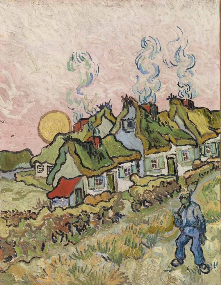
Charting a journey through France, this exhibition examines how place informed the work of modern painters in the late 19th and early 20th centuries. The exhibition begins in Paris and its suburbs, dynamic places that were at once semi-industrial, as in Van Gogh’s The Factory, and sites of blooming suburban leisure, as in Monet’s Madame Monet EmbroideringLife in and around Paris and the coastal regions of Normandy and Brittany inspired the radical brushwork, light palette, and contemporary subject matter of impressionists like Monet and Pierre-Auguste Renoir, their mentor and friend Édouard Manet, and the post-impressionists. Several of these painters subsequently moved to the South of France, seeking the warmer climate and dazzling sunlight that intensified their colors.

From Paris to Provence: French Painting at the Barnes highlights Van Gogh’s time in Arles and Saint-Rémy—uniting, for the first time, several Van Gogh paintings from the Barnes collection on one wall—as well as Cézanne’s deep connection to his native Provence, with nearly 20 works depicting scenes from the countryside and his family home, the Jas de Bouffan. Finally, the exhibition returns to Paris to explore a new generation of painters who flocked there from across Europe—Amedeo Modigliani, Chaïm Soutine, Giorgio de Chirico, and Joan Miró—and reaffirmed the French capital’s place as the center of modern art.

Creating space for new conversations between worksa critical aspect of education, research, and public access—this exhibition will provide visitors a rare opportunity to temporarily experience these paintings in new contexts and juxtapositions. While this exhibition is on view, rooms 2 through 13 of the Barnes collection will be closed for a floor refinishing project. Following the exhibition, the paintings will return to their original locations in the galleries.

“Featuring a wide variety of works from the first-floor galleries, this exhibition emphasizes the historical and cultural context of the paintings and offers the extraordinary opportunity for visitors to encounter beloved French paintings from the Barnes collection in new conversations,” says Thom Collins, Neubauer Family Executive Director and President.

“By seeing these works juxtaposed for the first time, visitors will discover how particular places—with their distinct landscapes, light, and people—shaped the work of each artist,” says Cindy Kang. “I hope this exhibition will inspire audiences to see these well-known paintings in a new light and with a renewed sense of appreciation and level of understanding.”

The exhibition will feature more than 50 major paintings from the first floor of the Barnes collection. Highlights include:


  • Édouard Manet, Laundry (1875): In this canvas, a woman washes linen in a flower-filled garden in Paris. A child to her right, as if eager to help, tugs at the pail of suds. Washerwomen were popular figures in 19th-century art and literature. Manet’s good friend Émile Zola, for example, described their tough lives in his novels. But this depiction is idyllic. Flashes of white paint—offset by grays and blues—become sunlight on the drying fabric. After the jury of the French Salon, the annual state art exhibition, rejected this painting, Manet exhibited it independently.

  • Claude Monet, The Studio Boat (1876): The figure in the boat is likely the artist, who outfitted this floating studio with all his supplies so that he could paint from the middle of the Seine River. Boating culture in Argenteuil, a suburb of Paris, inspired him to have this vessel constructed to his specifications. Often Monet would anchor his boat when working. But sometimes he painted as he drifted down the river, creating landscapes that are more a collection of momentary glimpses rather than a depiction of one specific spot.

Vincent van Gogh, The Postman (Joseph Étienne-Roulin) (1889): Van Gogh probably met Joseph Étienne-Roulin, a postman at the Arles train station in the South of France, when the artist rented a room above the nearby Café de la Gare. The two shared similar left-leaning political views and became close friends; in fact, it was Roulin who cared for Van Gogh during his hospital stay in nearby Saint-Rémy. Van Gogh painted six portraits of Roulin between 1888 and 1889 as well as several of Roulin’s wife and children.
 
  • Paul Cézanne, Mont Sainte-Victoire (1892–95): Mont Sainte-Victoire, which towers over the Aix-en-Provence region of southern France, was one of Cézanne’s favorite motifs. He spent his childhood exploring its terrain, and he painted it several dozen times from different vantage points. The mountain also held symbolic meaning to the artist, representing the ancient countryside during a moment of rapid industrialization and modernization. On the right side of the canvas, one can just make out an ancient Roman aqueduct.
 

  • Amedeo Modigliani, Portrait of the Red-Headed Woman (1918): Modigliani’s portrait of a woman who was part of his international, bohemian circles in Paris suggests how women’s lives had changed by the early 20th century. With her vivid hair and strapless dress, she drapes her shoulder over the chair and addresses the viewer with an unapologetic gaze. Her revealing dress shows how bold new fashions could represent a form of freedom. Modigliani used a thick round brush to describe the model’s flesh, and the textured surface seems to invite touch.

De Chirico and the Theatre


Serlachius, Mänttä f

15 March to 17 August 2025

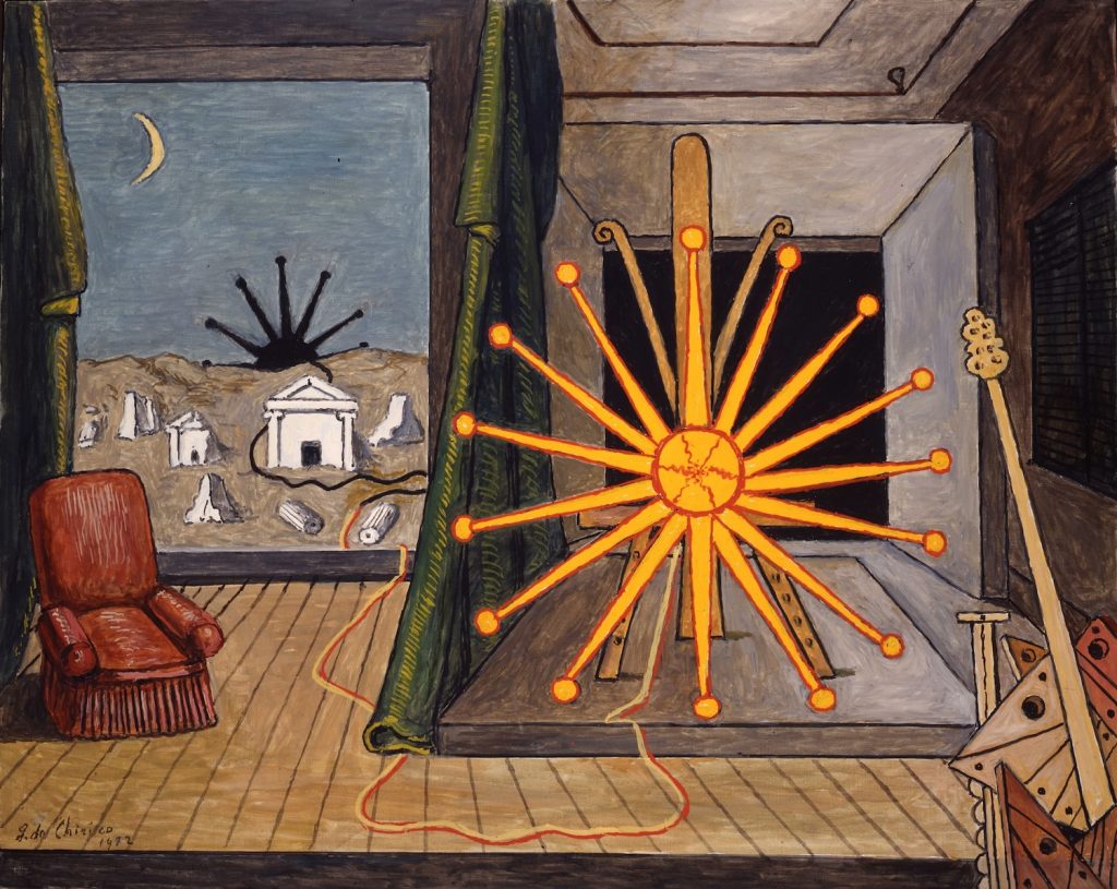
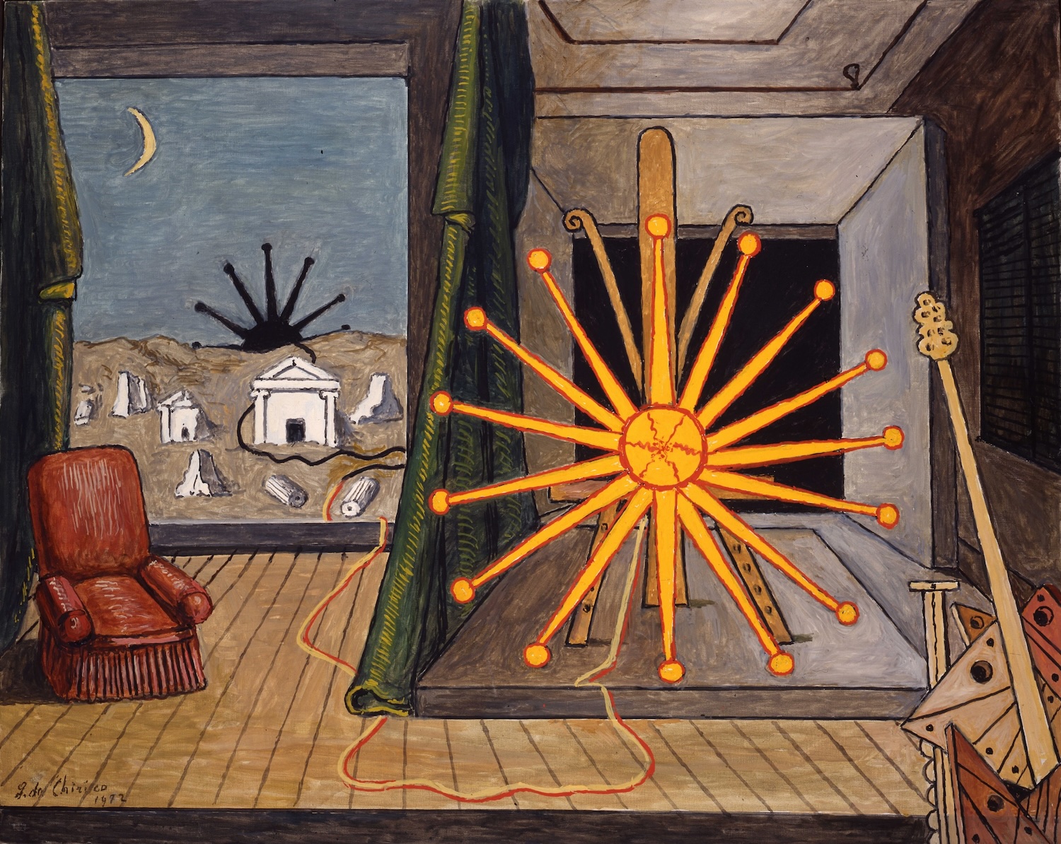
Giorgio de Chirico, Sole sul cavalletto, 1972, oil on canvas. Courtesy of the Foundation of Giorgio and Isa de Chirico. Photo: G. Schiavinotto
Giorgio de Chirico, Sole sul cavalletto, 1972, oil on canvas. Courtesy of Foundation Giorgio and Isa de Chirico. Photo: G. Schiavinotto

A creator of metaphysical art, Giorgio de Chirico’s work in the field of stage design and his relationship with the city of Rome take centre stage in the exhibition De Chirico and the Theatre, on display at Serlachius from 15 March to 17 August 2025. This is the first time the artist’s work is presented so extensively in Finland.

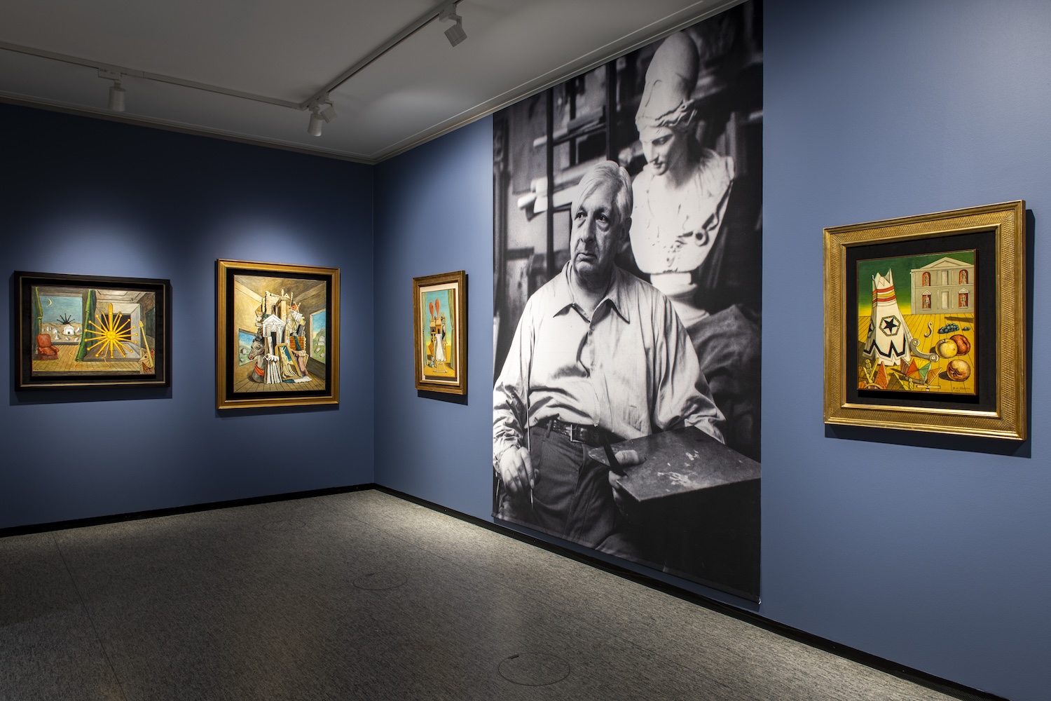
Italian artist Giorgio de Chirico (1888–1978) is known for creating the metaphysical art movement in the 1910s. His paintings depict bizarre spaces and landscapes where architectural elements and perspectives create a dreamlike atmosphere. De Chirico is considered one of the most significant innovators in 20th-century painting.

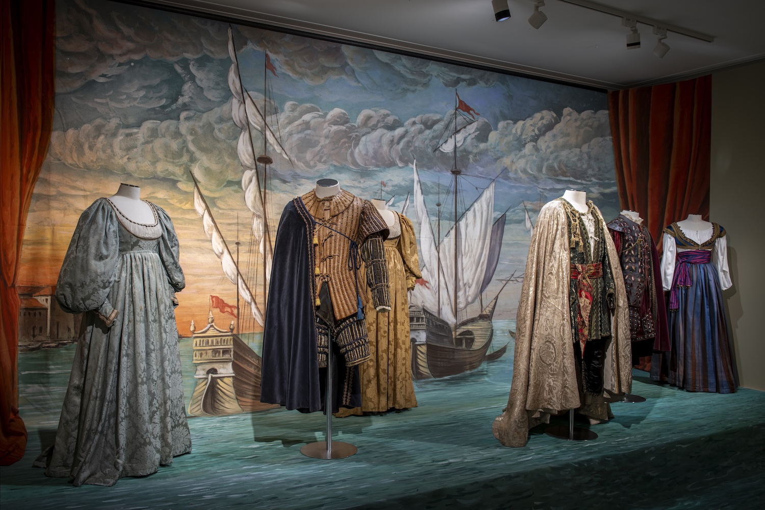
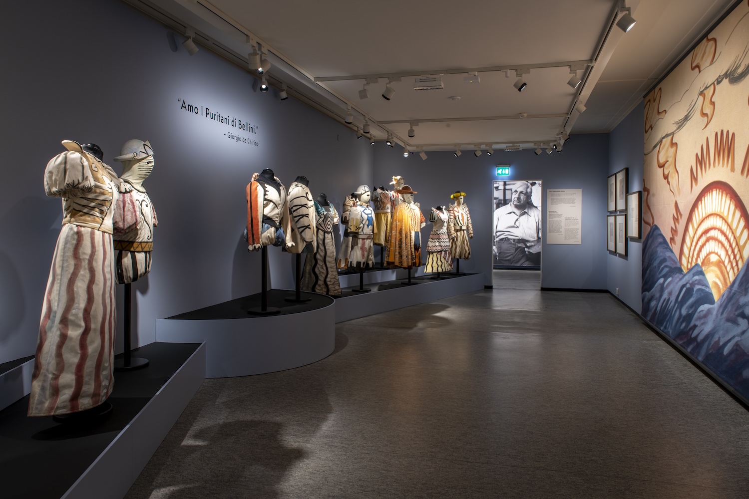
The exhibition at Serlachius showcases de Chirico’s set and costume designs for the Rome Opera, as well as finished sets and costumes. There are also many of his paintings and drawings from the Foundation Giorgio and Isa de Chirico, including works that have never been publicly displayed before.

The exhibition is curated by artist Hannu Palosuo, Opera Stage Director Italo Nunziata, who has worked at the Rome Opera, and curator Cornelia Bujin. Their direct contacts with Rome’s art institutions and unique perspective on de Chirico’s art have contributed to bringing the exhibition to Serlachius.

A great lover of opera

De Chirico loved opera and designed sets and costumes for dozens of productions. He was a prolific writer and often used expressions related to stage art, such as “we step onto the stage of art” or “the sky like a curtain.” The artist’s personal relationship with opera and art in general is conveyed to visitors through the exhibition’s wall texts.

The exhibition features two productions seen at the Rome Opera: Rossini’s Otello and Vincenzo Bellini’s The Puritans, originally created for the Florence Opera but also performed in Rome. The third production in the exhibition is Vittorio Rieti’s ballet Le Bal, originally created for the Monte Carlo Opera but later seen in Rome.

De Chirico’s set design for The Puritans caused a huge scandal in 1933, significantly changing the role of set design in opera. De Chirico had adopted from the Ballets Russes the Parisian method of integrating set and costume design as an integral part of the opera’s text and choreography. The Florence Opera audience was not yet ready for this approach.

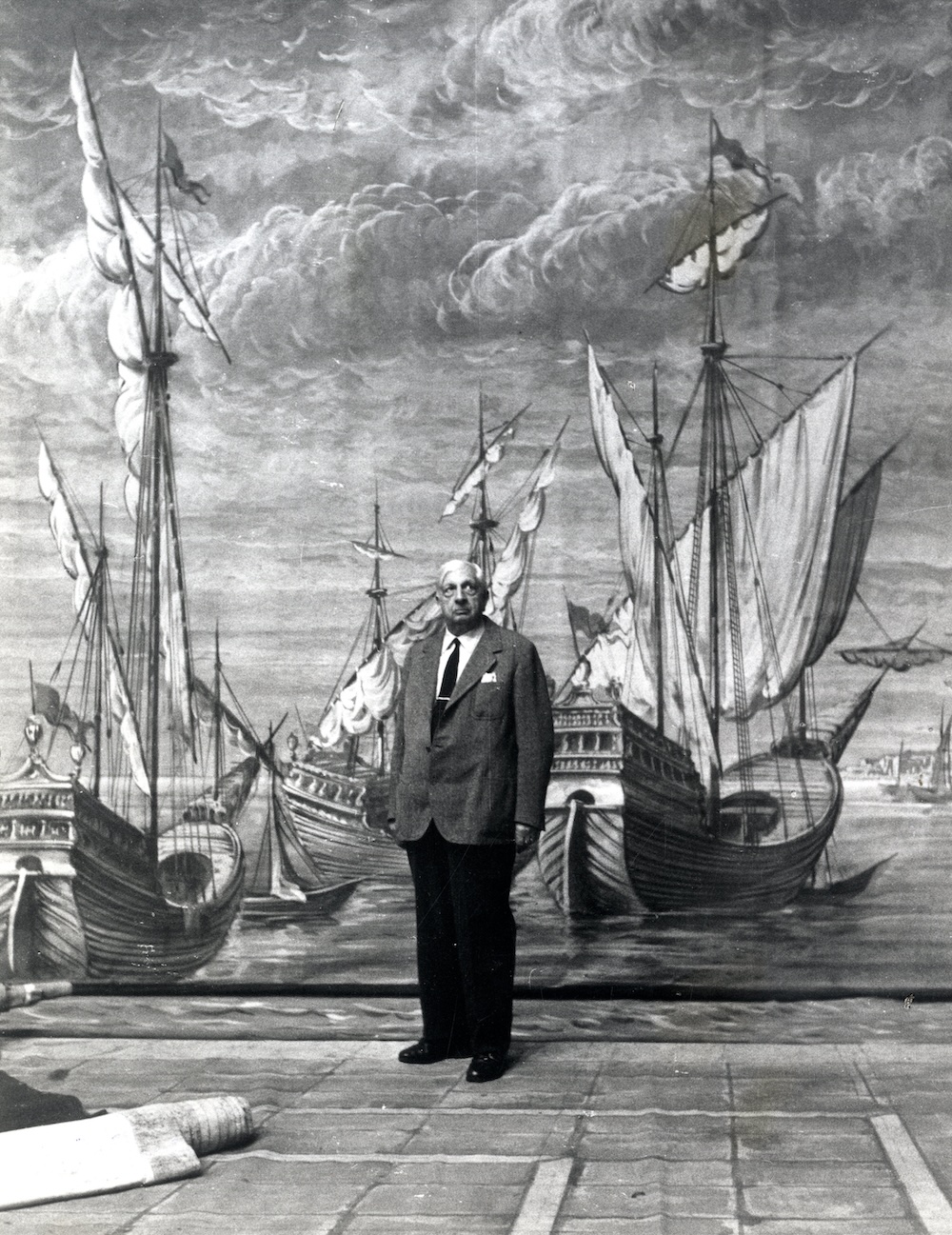
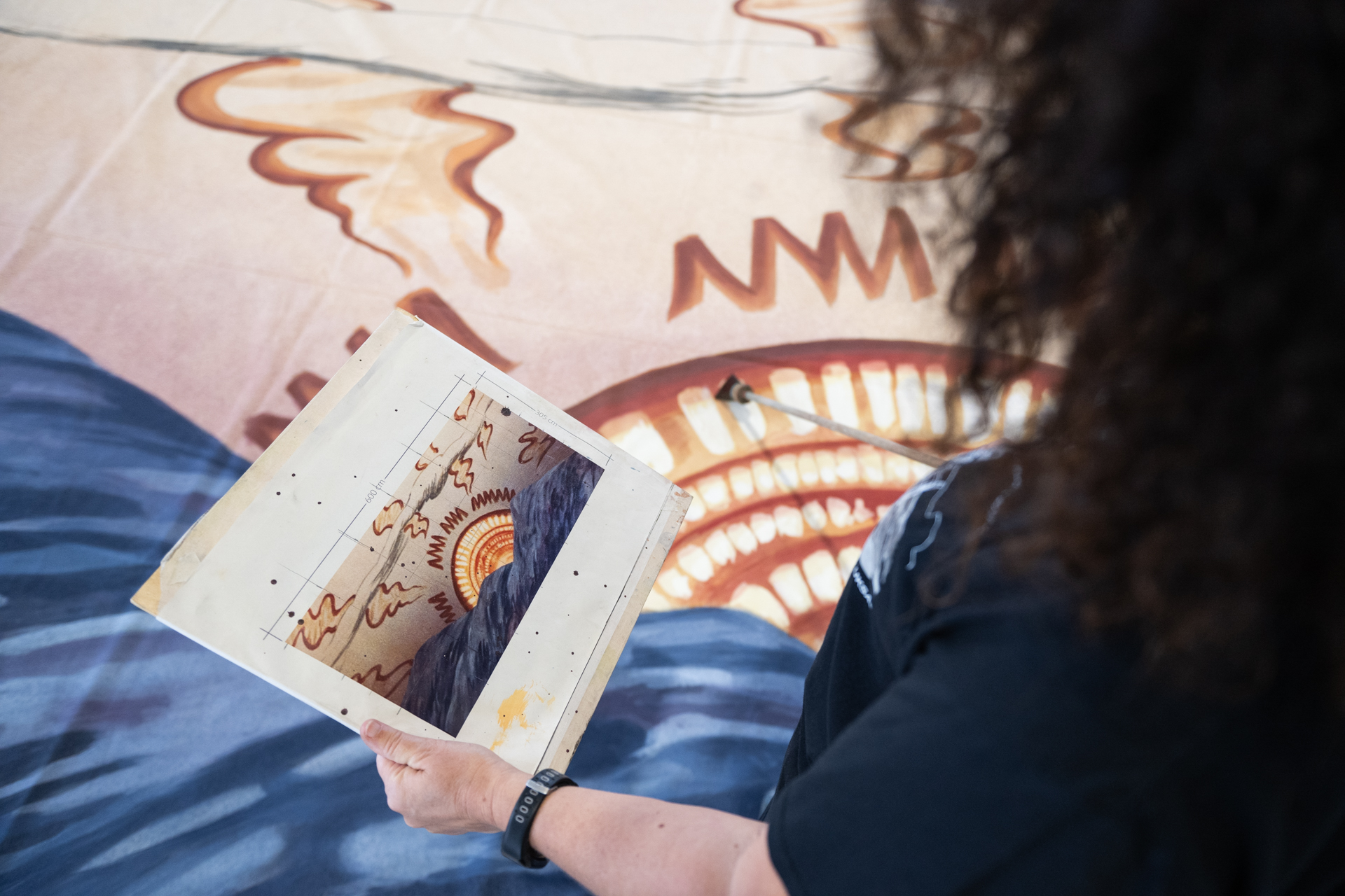
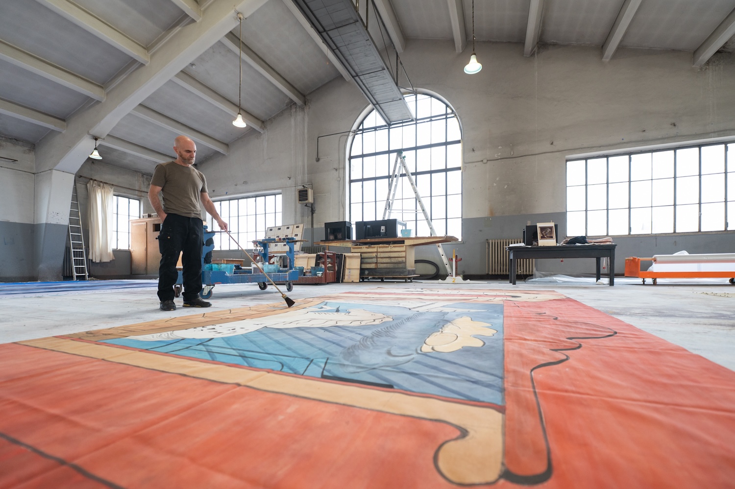
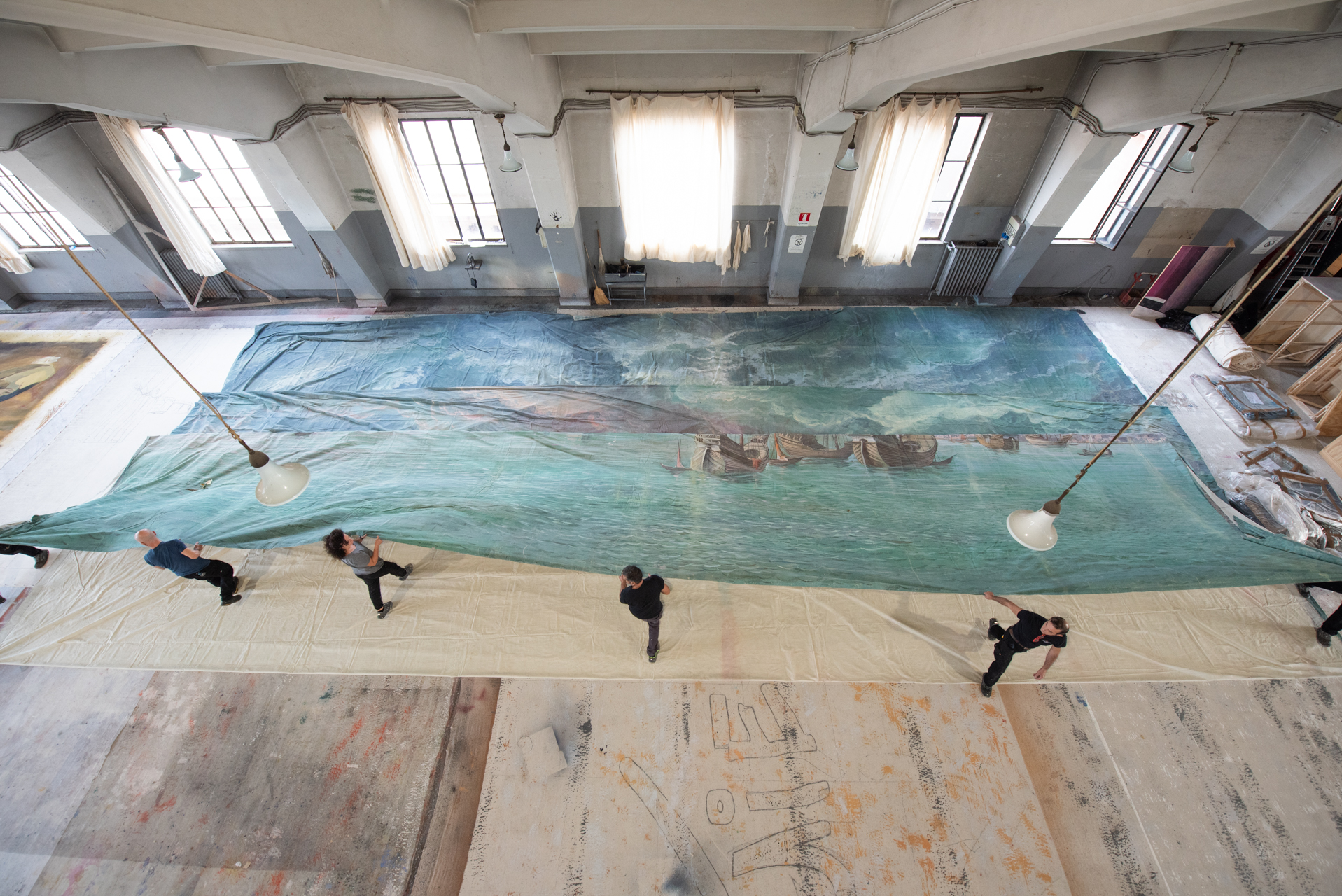
De Chirico did not paint the sets he designed; skilled set painters did. The sets for the exhibition have as well been painted at the Rome Opera based on the artist’s sketches and using old techniques. Costumes made for the productions and outfits de Chirico borrowed for his grand parties will also be on loan from the opera.

Paintings from the later career

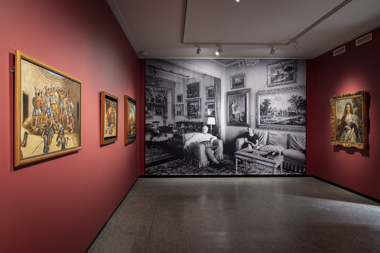
The exhibition features numerous paintings, drawings, and sketches from the Foundation Giorgio and Isa de Chirico. One room recreates the atmosphere of his studio home in Rome. There are drawings that have never been publicly displayed before, which the artist drew while sitting in the opera, observing the audience and the stage.

The paintings on display are mostly from the latter part of his career when he returned to the metaphysical and baroque themes of his youth, creating more refined art. The exhibition also tells the story of de Chirico’s relationship with Rome.

The exhibition will be on display at Serlachius Headquarters in Mänttä from 15 March to 17 August 2025. It is organised in collaboration with the Fondazione Giorgio e Isa de Chirico, Teatro dell’Opera di Roma, Maggio Musicale Fiorentino, and Fondazione Cerratelli.

Publication


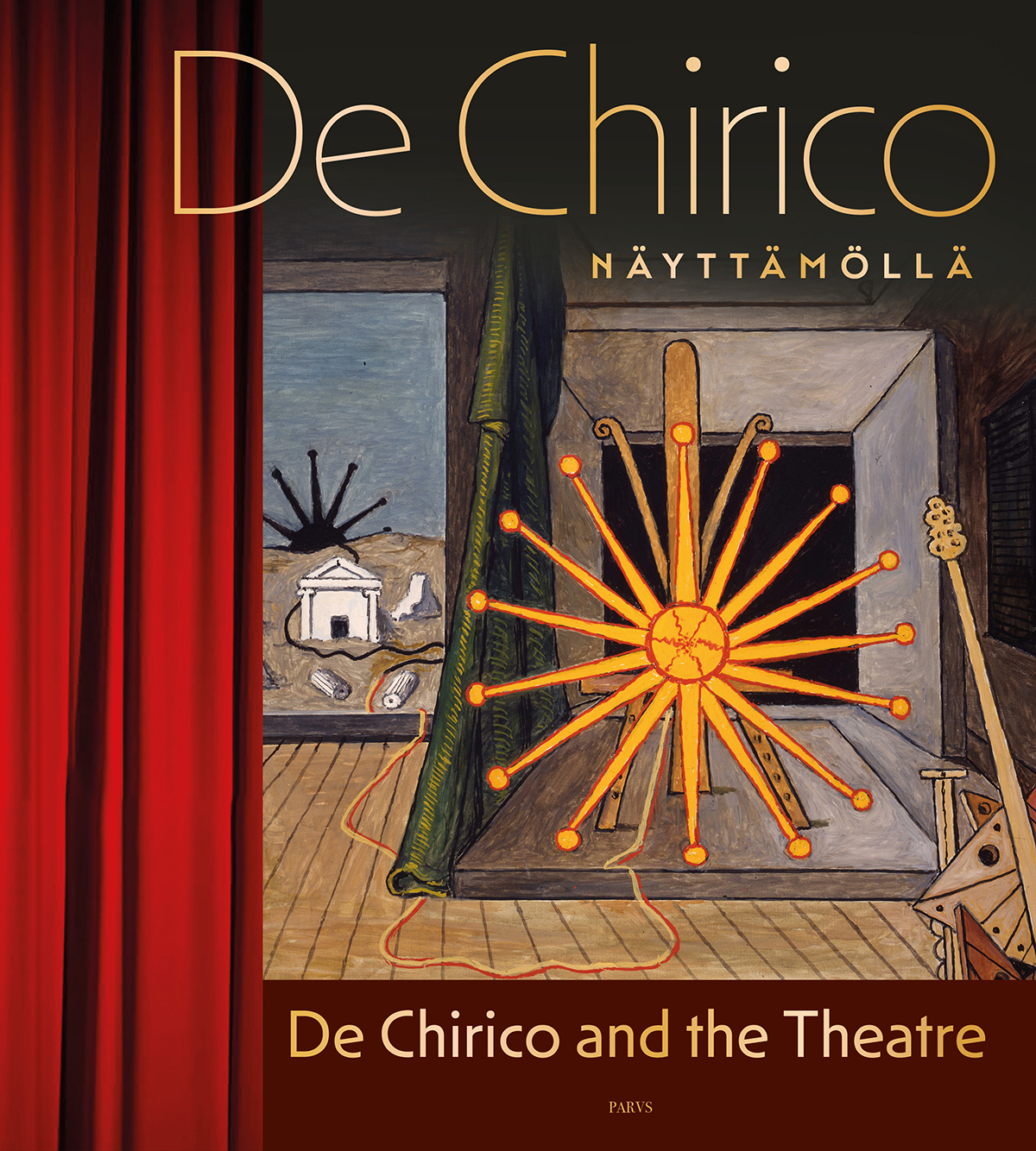
De Chirico näyttämöllä | De Chirico and the Theatre

de_chirico_1200
230 x 255 mm, hard cover
approx. 192 pages
Writers Simonetta Antellini, Cornelia Bujin, Lorenzo Canova, Giorgio de Chirico, Italo Nunziata, Hannu Palosuo, Paolo Picozza, Pauli Sivonen (foreword)
Layout Ville Karppanen
Finnish, English
ISBN 978-952-7611-02-9
Serlachius
April 2025
€39

Giorgio de Chirico (1888-1978) was an Italian painter and founder of the art movement known as Metaphysical Art (Pittura Metafisica). This book tells the story of the artist’s intimate relationship with Rome, the city where he lived and worked for thirty years. It is devoted especially to exploring de Chirico’s work as the designer of costumes and sets at the Teatro dell’Opera di Roma. The book presents an extensive selection of de Chirico’s lesser-known neo-metaphysical and neo-baroque paintings and drawings, which he bequeathed to the foundation bearing his name. Some of the works presented in this publication are previously unknown to wider audiences.

This book and the accompanying exhibition have been produced as a collaboration between Serlachius, Fondazione Giorgio e Isa de Chirico, Teatro dell’Opera di Roma, Maggio Musicale Fiorentino and Fondazione Cerratelli.


Images

Costume and set design by Giorgio de Chirico for Rossini's opera Otello. Photo: Serlachius, Sampo Linkoneva
Costume and set design by Giorgio de Chirico for Rossini’s opera Otello. Photo: Serlachius, Sampo Linkoneva
Costume and set design by Giorgio de Chirico for the opera I Puritani.
Costume and set design by Giorgio de Chirico for the opera I Puritani. Photo: Serlachius, Sampo Linkoneva
Photo: Serlachius, Sampo Linkoneva
View from the De Chirico and the Theatre exhibition. Photo: Serlachius, Sampo Linkoneva
Photo: Serlachius, Sampo Linkoneva
View from the De Chirico and the Theatre exhibition. Photo: Serlachius, Sampo Linkoneva
De Chirico Rooman Oopperan Otello-esityksen lavasteissa 1963. Kuva: Rooman Ooperatalon historiallinen arkisto
Artist Giorgio de Chirico on the sets of opera Otello 1964. Photo: Archivio Storico del Teatro dell’Opera di Roma
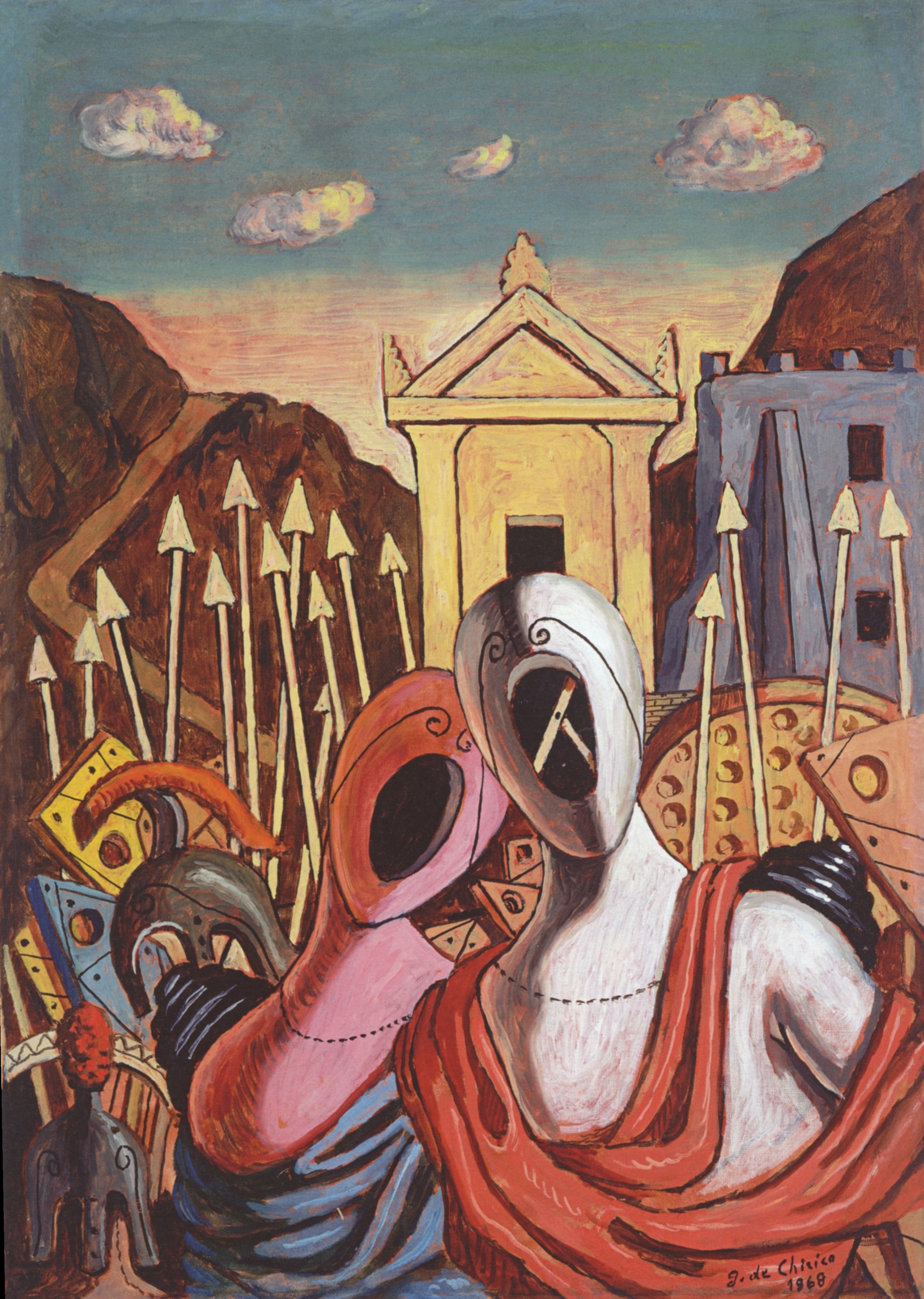
Giorgio de Chiricon surrealistinen maalaus, jossa on etualalla aavemaisia hahmoja ja takana temppelimäinen rakennus.
Giorgio de Chirico, Ettore e Andromaca davanti a Troia, 1968, oil on canvas. Courtesy of Foundation Giorgio and Isa de Chirico. Photo: G. Schiavinotto
Giorgio de Chirico, Sole sul cavalletto, 1972, öljyväri kankaalle. Kuva: G. Schiavinotto.
Giorgio de Chirico, Sole sul cavalletto, 1972, oil on canvas. Courtesy of Foundation Giorgio and Isa de Chirico. Photo: G. Schiavinotto
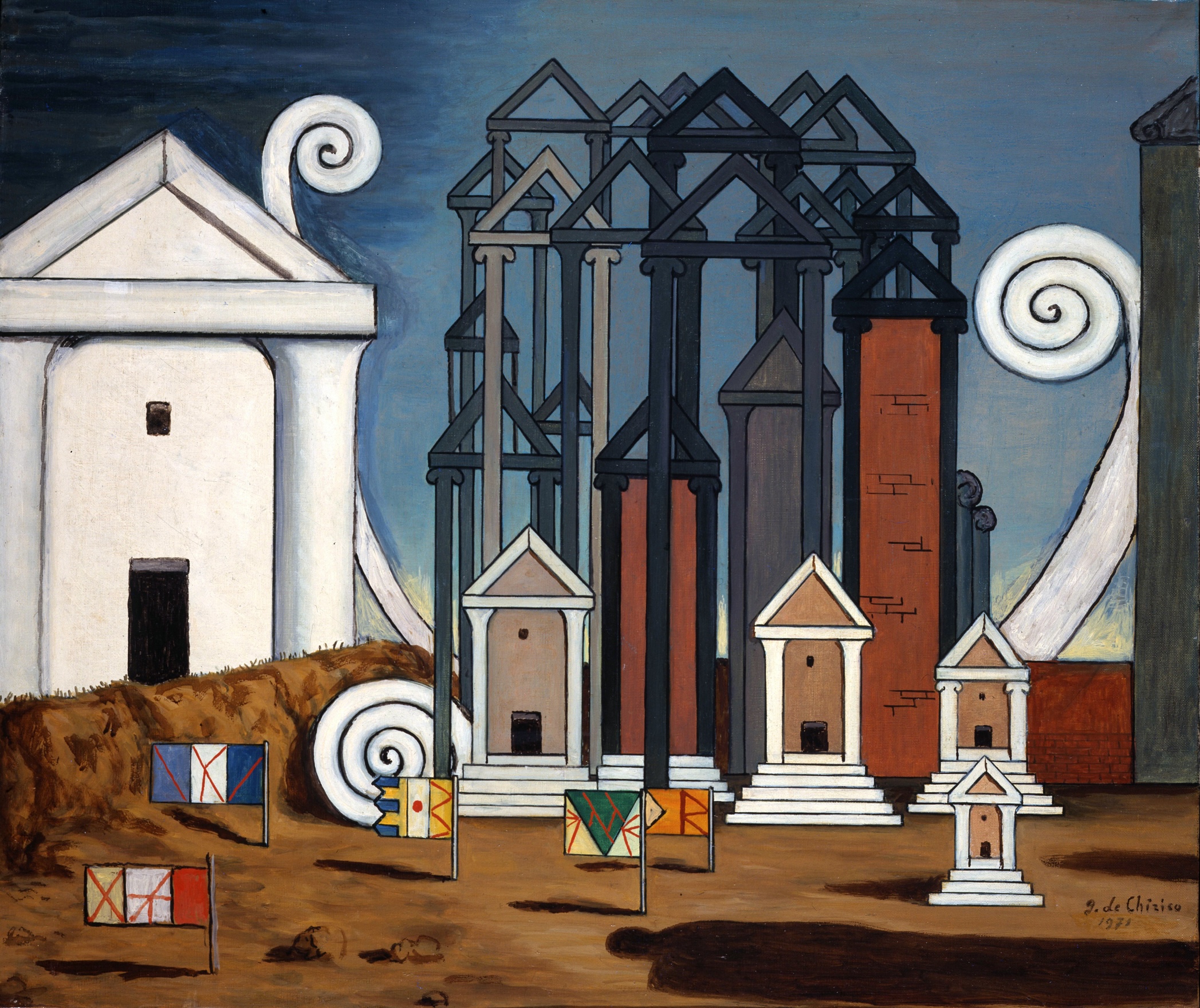
Giorgio de Chiricon surrealistinen maalaus, jossa näkyy valkoinen temppeli ja muita rakenteita.
Giorgio de Chirico, Termopili, 1971, oil on canvas. Courtesy of Foundation Giorgio and Isa de Chirico. Photo: G. Schiavinotto
Henkilö maalaa lavastetta Giorgio de Chiricon luonnoksen pohjalta Rooman Oopperassa.
The sets are painted at the Roman Opera based on de Chirico’s designs. Photo: Fabrizio Sansoni
Mies maalaa lattialla olevaa suurta lavastekangasta pitkävartisella siveltimellä Rooman Oopperassa.
The sets are painted at the Roman Opera based on de Chirico’s designs. Photo: Fabrizio Sansoni
Suurta meriaiheista, lattialla makaavaa lavastekangasta kootaan neljän ihmisen voimin rullalle.
The set fabric painted at the Roman Opera based on Giorgio de Chirico’s sketches is spread on the floor. Photo: Fabrizio Sansoni

Monday, March 10, 2025

Edvard Munch: Technically Speaking

https://s3.amazonaws.com/media.harvardartmuseums.org/production/file_uploads/PressRelease/pdfs/000/000/133/original/b1ea941c28efce1e.pdf

This spring, the Harvard Art Museums present an exhibition of works by Edvard Munch that examines the artist’s innovative techniques and the recurring themes across his paintings, woodcuts, lithographs, etchings, and combination prints. Highlighting the collaborative partnership between curatorial and conservation experts at the museums, the exhibition reveals new and ongoing technical research into Munch’s practice and shares recent discoveries about his materials and highly experimental methods. 

Drawing on the strength of the museums’ collections, Edvard Munch: Technically Speaking will be on display March 7 through July 27, 2025, in the Special Exhibitions Gallery on Level 3 at the Harvard Art Museums. An array of public programs accompanies the exhibition, including an opening lecture on Thursday, March 6, at 6pm, a film screening, a seminar, and multiple gallery talks and tours. The exhibition showcases 70 works, primarily from the Harvard Art Museums collections. Thanks to a transformative gift from Philip A. and Lynn G. Straus, the museums now house one of the largest and most significant collections of artwork by Munch in the United States—a collection that is also distinctive for its technical variety. Key loans from the Munch Museum in Oslo include two paintings and eight examples of the artist’s materials used for printmaking, seven of which have never before been on display in the United States. The exhibition is curated by Elizabeth M. Rudy, Carl A. Weyerhaeuser Curator of Prints, and Lynette Roth, Daimler Curator of the Busch-Reisinger Museum; with Peter 

Murphy, Stefan Engelhorn Curatorial Fellow in the Busch-Reisinger Museum. This is the first major presentation at Harvard to examine Munch’s techniques and materials through the lens of the Strauses’ collection in 30 years, following the 1983 exhibition and publication Edvard Munch: Master Printmaker (organized by Charles W. Haxthausen and written by Elizabeth Prelinger) and Norma S. Steinberg’s 1995 exhibition and catalogue Munch in Color. Norwegian artist Edvard Munch (1863–1944) is well known for his innovative experiments in painting and printmaking. He often rendered the same subject matter in both mediums—repeatedly over decades—to investigate their distinctive possibilities. His highly expressive work deals with psychological themes of isolation, separation, anxiety, illness, and death, but also attraction and love. Technically Speaking explores Munch’s fascination with materiality, uncovers new avenues for thinking about his work, and delves into his unconventional techniques and the various themes he returned to again and again over many years. “This exhibition showcases an exciting selection of Munch’s paintings and prints from a career that spanned more than 60 years,” said Elizabeth M. Rudy. “We are thrilled to present his work through a lens that is perfect for a university museum—one that reinforces our teaching and research mission— by sharing the results of our recent investigations into his techniques and materials.” 


Edvard Munch, Two Human Beings (The Lonely Ones), 1906–8. Oil on canvas (linen) commercially primed with a white ground. Harvard Art Museums/Busch-Reisinger Museum, The Philip and Lynn Straus Collection, 2023.551. Photo: © President and Fellows of Harvard College; courtesy of the Harvard Art Museums.

The exhibition begins with several iterations of Two Human Beings (The Lonely Ones), depicting a man and a woman standing at a shoreline, side by side yet isolated from one another. First painted by Munch in 1892 (a work later destroyed in an accident at sea), 


the motif is repeated in an etching from 1894 that depicts the original painting


 and five subsequent woodcuts that Munch produced between 1899 and 1917. The prints reveal the various intriguing woodcut and etching techniques the artist utilized and also show how he manipulated his jigsaw woodblocks to print different parts of a single work in different colors. They are displayed in the exhibition with the original steel-faced copperplate and jigsaw woodblock that were used to produce the prints. 

Two paintings on display continue the motif: the artist’s 1906–8 version from the Busch-Reisinger Museum’s collection is based on his woodcuts, and a later (final) version from around 1935, on loan from the Munch Museum, reverts to the composition of the couple used by Munch in his 1892 painting. “Two Human Beings (The Lonely Ones) remains one of Munch’s most well-known subjects, and we are extremely fortunate to be able to trace his engagement with it over a period of more than 40 years and through nine works in our collections, supplemented by the generous loan of his last painting of the motif and two related matrices from the Munch Museum,” said Lynette Roth. “Together, they demonstrate the close relationship between painting and printmaking in Munch’s practice, his dedication to certain motifs over time, and his embrace of chance effects.” 

Several other groupings highlight additional recurring themes in Munch’s work and how he experimented with their representation. Three woodcuts from the 


Woman’s Head against the Shore series show how Munch selectively printed his jigsaw woodblocks, omitting one of the pieces (the water) in one of the impressions. 


Four prints from The Kiss series—an etching and three woodcuts— portray a couple embracing in front of different backgrounds. Prints from Melancholy I and Melancholy III, on display with a rare example of Melancholy II, which Munch printed himself with his small handcrank press, are shown with five of the artist’s original carved woodblocks. Four variations of Vampire II demonstrate how Munch sometimes combined lithographs with hand coloring and used woodblocks to add color as well. Also on display are three versions of Man’s Head in Woman’s Hair, including one used by Munch as a poster advertising an exhibition of his work at Diorama Hall in Kristiania (now Oslo) 

Over the last several months, the works in the exhibition from Harvard’s collections have undergone technical study, including pigment analysis, selective treatments such as cleaning and varnish removal, and most of the prints were rematted and reframed. The painting Two Human Beings (The Lonely Ones) (1906–8) was varnished at some point in its history, which is not consistent with Munch’s practice of leaving his canvases without a unified glossy surface; this varnish has been removed. Train Smoke (1910) needed paint stabilization and cleaning to remove atmospheric grime, and Winter in Kragerø (1915) had its varnish removed to reveal a more vibrant snowy scene. This work was carried out by staff from the Straus Center for Conservation and Technical Studies, including Ellen Davis, Associate Paintings Conservator; Abby Schleicher, Assistant Paper Conservator; and Kate Smith, Senior Conservator of Paintings and Head of the Paintings Lab, and their findings are presented in the exhibition. Additionally, all six paintings on display from Harvard’s collections were reframed with new, historically accurate frames. 

Jim Dine

The ALBERTINA Museum

 8 November 2024 – 23 March 2025 


The ALBERTINA Museum is presenting the highlights of its large collection of works by Jim Dine - a representative selection of the artist's generous donation that represents his oeuvre in a multifaceted way. Jim Dine is often categorized as one of the pioneers of Pop Art: a misunderstanding. But anyone who, like Dine, arranged everyday objects into assemblages, no matter how much they were interwoven with his own biography, was almost inevitably assigned to Pop Art in the early 1960s. 

Jim Dine's early preference for “popular motifs” such as the heart, garishly colorful and loud, or the subject of the trivial bathrobe inevitably drew him into the maelstrom of this American awakening of the 1960s. Added to this was the artist's admiration for the fathers of Pop Art, Jasper Johns, Robert Rauschenberg and Claes Oldenburg: the label of Pop Art was thus to stick to Jim Dine's work for a long time, thus blocking access to its deeply subjective dimension. 

Jim Dine describes himself as a drawing painter and is rightly convinced that he cannot be pigeonholed into any art genre or ism. His free and unconventional approach to the possibilities of painting, drawing and printmaking and his openness to experimentation, whether it leads to abstraction or remains connected to the representational, are an expression of his value-free encounter with the pictorial object. 

The self-portrait as a revelation of the self 

The large number of self-portraits is a special feature of Dine's work. Even the clarification that the artist understands the bathrobe as a self-thematization, as a self-portrait, has not prevented this group of works from being seen as merely the reproduction of the most external thing that can clothe a person. The group of self-portraits allows for an independent, intensive and surprising dialog with the artist and his work. While Rembrandt, for example, portrays himself in his self-portraits as a drunken beggar, a nobleman, a prodigal son, a successful painter or a failed, doubting painter. Albrecht Dürer also knows the wide range between the Christological self-interpretation or the proud fianc

 In contrast to these forefathers of the self-portrait, Jim Dine always shows the same “I”, the same face, with little emotional variation. He almost always has the same facial expression: his gaze is serious. Jim Dine does not disguise himself. He does not play roles. His self-portraits are not contributions to various stages of a long life. They are not an autobiography, a situational self-analysis, a profound study of the psyche, thoughts and feelings in a datable moment of life. Rather, Jim Dine's self-portraits are studies of that unchanging core of character that remains the same through all the ups and downs, storms, crises and joys of life. 

“I paint who I am, I paint what I am.” 

In this quote from Jim Dine, the artist declares his understanding of self-portrayal as a medium for revealing the self as it was, is and remains. The subjective in the objectivity of everyday life In fact, Jim Dine was always concerned with the innermost, the most subjective. For Dine, the bathrobe is an object with which he expresses his feelings. In fact, Jim Dine's work can be described as a reflection on himself. Marco Livingstone has rightly called Dine's work “a prolonged meditation on the self”. Not only is the motif of the bathrobe a placeholder for the artist himself, but the tools that have been omnipresent in his oeuvre for decades - hammer, saw, pliers - are also based on childhood memories of these strange objects. Nevertheless, for anyone who varies a bathrobe in hundreds of shapes, formats, techniques and colors, the bathrobe eventually becomes what it is: a bathrobe, an ordinary object. The use and further development of different printing processes testify to Dine's fascination with printmaking techniques. The artist always emphasizes the great importance of collaboration with the respective printer, not only because it represents an antithesis to solitary work in the studio, but also because creative exchange and productive implementation take place in this cooperation. Dine experiments with a wide range of techniques and materials and thematizes youth and age, intimacy and extraversion as well as seriality and creativity on paper. His figurative motifs can be read as representatives of the artist, as an objectification of his feelings, as Dine himself explains. 

 Exhibition Texts 

 Jim Dine and the Art of Print 

Jim Dine, born 1935 in Cincinnati, Ohio, is a versatile and eminent individualist in American art. He has had more than 300 solo exhibitions since the 1960s and is a multiple participant in the Venice Biennale and the Documenta. His extensive oeuvre comprises painting, sculpture, drawing, and printmaking. His works are represented in numerous renowned collections in America and Europe, including the Metropolitan Museum of Art and the Solomon R. Guggenheim Museum, New York, Tate Gallery, London, and the Stedelijk Museum, Amsterdam. 

The artist’s giant sculptures also often occupy prominent spots: In the early 2000s, he created his Cleveland Venus, an eleven-meter-high bronze sculpture that was installed on top of the entrance portico of the federal courthouse in Cleveland. Since 2008, the southern Swedish town of Borås has been home to his nine-meter-high sculpture Walking to Borås—a briskly striding Pinocchio. Jim Dine’s special love for printmaking has now lasted for more than half a century. 

In the nearly 65 years since he created his first lithograph, he has been exploring the full range of printmaking possibilities like almost no other artist. It is his innovative approach to the traditional printing techniques—woodcut, etching and lithography—that gives his prints significance beyond their motifs. The way Jim Dine develops these techniques is extraordinary: he works the printing plate, the woodblock, not just with a fine burin or gouge, but literally takes a chainsaw to it. 

The artist loves a playful approach to the printing blocks, which he keeps working and reworking and modifying in an ongoing process. He often pursues different processes in parallel and combines them on one sheet, always interested in developing new methods of treating a woodblock or printing plate so as to thus expand the range of possibilities in printmaking. The printer has an important role in the creation of a work. For Jim Dine, as for all great printmakers, this is a partner of crucial importance. 

This exhibition is based on the generous donation that Jim Dine made to the ALBERTINA Museum in 2022. It comprises 400 prints created between 1970 and 2024, many of which feature motifs familiar from his oeuvre: tools, hearts, bathrobes, birds, or the figure of Pinocchio. The collection is part of his “archive”, as the artist calls it, which he has divided up between different museums. The selection presented here once again is testimony to Jim Dine the printmaker’s passion and enthusiasm for the genre. 

 HEART 

No other of Jim Dine’s motifs has risen to such popularity as the heart. This symbol shape is the one that has appeared most frequently in his works over the decades. In Judeo-Christian culture, the heart has for centuries been understood as the organ that enables love in humans—first and foremost, the love of God. In the Middle Ages, the heart also became the seat of worldly love and passion, especially in minnesong. The pictorialization of the heart by a simple graphic symbol has also been common for a long time and can already be found in the emblem art of the 17th century. It is a long motif tradition that Jim Dine picks up on when, from the mid-1960s, he made the heart the subject of his art, relying on its visual power as a sole motif. 

In the 1990s, when the artist’s thematic range expanded to include a number of more motifs, the heart was somewhat backgrounded in his work. However, Jim Dine would not completely abandon it: In a work of 1991, the heart even stands for the artist himself. In The Woodcut Self, he identifies with the blue heart not only through the title: From its center, his own wide-open eye is looking out at us. 

NATURE & BIRDS 

Motifs from nature and landscape appear only sporadically in Jim Dine’s prints in the early years. The most extensive project in this circle of motifs was begun in 1978, when the artist created a series of nine etchings, each dedicated to a specific type of flower. Animal pictures added to the floral and landscape motifs in the mid-1990s. The bird motif is based on a dream and childhood memory. During a visit to the zoo, a crow started speaking to the boy, its words clearly articulate to him: “Hello, my name is Jimmy.” That was what his parents called him at the time. 

The effect of two etchings of 1994, Owl and Raven on Cloth, is ambivalent: One can appreciate the virtuoso drawing of these motifs—the artist used taxidermy animals as models—and admire how Jim Dine handled a chainsaw to cut the delicate structure of the feathering into the printing block for the owl woodcut. At the same time, the birds with their fixed stare also have something menacing about them: the raven brings to mind the ominous animal from Edgar Alan Poe’s poem of the same title “The Raven”.

PINOCCHIO 

In the mid-1990s, a literary figure entered Jim Dine’s work that still fascinates the artist today: Pinocchio. Carlo Collodi’s The Adventures of Pinocchio, first published as a serialized novel in 1881, tells the story of a naughty wooden puppet’s long journey to goodness—to this day one of the most famous novels of development in children’s literature. Often retold and made into movies, including one by Walt Disney in 1940, the wooden rascal is known worldwide. The seeds of Jim Dine’s enthusiasm were already sown in his childhood. “When I was six years old, my mother took me to see the Disney Pinocchio film. It has haunted my heart forever! This talking stick became a real human after an eternity of tests given to his then wooden semblance of a soul. Geppetto and the author, Carlo Collodi, gave the boy the chance to come to consciousness and therefore join us in this valley of tears.” For Dine, Pinocchio is therefore not just a sentimental memory of early childhood days, but becomes an emblem of the process of humanization as such, which, no matter the setbacks, ultimately gives hope for a good outcome. At the same time, the artist is fascinated by the literary figure of Geppetto, a kind of “outsider artist-Pygmalion”, who turns a mere piece of wood into a wooden puppet that eventually becomes a boy of flesh and blood. The artist’s original dream of bringing dead matter to life—even if only at a symbolic level—has lost none of its significance for Jim Dine to this day. 

SELF-PORTRAIT 

The exploration of his own self is a consistent thread running through Jim Dine’s oeuvre. However great his interest in artistic selfreflection, though, the artist initially rejected the classic pictorial concept of the self-portrait. Instead, he established the motif of the bathrobe as a placeholder for his own self. In 1964, Jim Dine came across an advertisement for a men’s bathrobe in the New York Times. The artist made the garment his proxy, his alter ego. Aside from this special form of artistic selfpresentation, he also picked up on the pictorial tradition of self-portraiture again in the mid-1970s, which went hand in hand with a rediscovery of the human figure. From then on, the self-portrait remained a central theme in Dine’s work, which manifested itself in a variety of ways over time. The apogee doubtless is the series 55 Portraits, which he created in 1995. Ten years before that, the ongoing examination of his own self had already led to the establishing of another central pictorial motif in the artist’s work: the human skull. One of his earliest works on the subject is the large-format 10 print The Side View from 1986, which goes back to an illustration in the textbook Gray’s Anatomy: First published in the mid-19th century, it has since seen dozens of new editions and has, to this day, been the most important anatomical reference in the English-speaking world as well as a source of inspiration for many artists like, for example, Jean-Michel Basquiat. 

 TOOLS 

Tools have fascinated Jim Dine ever since he was a little child. “At three years old, I remember sitting on the steps outside my grandfather’s garage and taking pieces of pipe, and rolling them down the stairs, just letting them go, like a Slinky toy, but it was pipe. I would just play with these objects of desire, like a hammer, or I’d grab a screwdriver and pretend to be an adult. I thought they were so beautiful. It was a non-verbal meeting.” Dine’s maternal grandfather was running a hardware and tool store at the time. His father, on the other hand, owned a store selling paint and plumbing supplies, including tools. Although Dine moved in with his grandfather at the age of 14— his mother had died two years earlier—he helped out time and again in both stores, which made an impression for life. In the early 1960s, tools appeared not only in his paintings, but also in his graphic art, which he started discovering for himself at the time. In subsequent years, these motifs gained more and more ground in Jim Dine’s work, although he initially confined himself to three basic types: hammer, pliers, and paintbrush. Electrically powered tools did at first not find their way into his oeuvre—not even when, in the mid-1970s, he discovered the many possibilities they offered to work on printing plates—but only much later. Jim Dine’s interest in tools as motifs for his art has been almost obsessive, and has remained so until today. 1

Images 


Jim Dine Asleep with his Tools Jim Dreams, 2018 Woodcut, hand colored, five-piece Each 185 x 70 cm The ALBERTINA Museum, Vienna © Bildrecht, Vienna 2024 Jim Dine 

A Heart At The Opera, 1983 Print on paper 130 x 95 cm The ALBERTINA Museum, Vienna © Bildrecht, Vienna 2024 

Jim Dine B/W Robe BW proof, 2019 Woodcut 190 x 120 cm The ALBERTINA Museum, Vienna – Donation of the artist and Diana Michener © Bildrecht, Vienna 2024

 Jim Dine The Side View, 1986 Etching, soft ground, drypoint 120 x 115 cm The ALBERTINA Museum, Vienna © Bildrecht, Vienna 2024 

Jim Dine Raven on Cloth, 1994 Drypoint etching on canvas 115 x 100 cm The ALBERTINA Museum, Vienna – Donation of the artist and Diana Michener © Bildrecht, Vienna 2024 

Jim Dine Bleeding Boy, 2008 Linocut 170 x 100 cm The ALBERTINA Museum, Vienna – Donation of the artist and Diana Michener © Bildrecht, Vienna 2024 

Jim Dine Untitled Tools (Portfolio of 9), 2009 Lithography on paper 60 x 45 cm The ALBERTINA Museum, Vienna – Donation of the artist and Diana Michener © Bildrecht, Vienna 2024 

Jim Dine The Summer (right part), 1992 Color woodcut, in three parts 115 x 90 cm The ALBERTINA Museum, Vienna – Donation of the artist and Diana Michener © Bildrecht, Vienna 2024 

Jim Dine New Pinocchio #16, 2003 Etching, handcolored, mounted on Kapa 145 x 90 cm The ALBERTINA Museum, Vienna – The ESSL Collection © Bildrecht, Vienna 2024

Leonardo – Dürer Renaissance Master Drawings on Colored Ground

The ALBERTINA Museum

 7 March – 9 June 2025


The ALBERTINA Museum is dedicating its spring 2025 exhibition to the most important masters of the art of drawing. Leonardo - Dürer. Renaissance Master Drawings on Colored Ground is the major inaugural exhibition of Director General Ralph Gleis and at the same time the world's first detailed museum show in this field: and the most comprehensive presentation of Leonardo in the Germanspeaking world to date. From an art-historical perspective, the exhibition is also a premiere: the subject is considered in a pioneering way across regions between Italy and the North. 

“With this exhibition, we are drawing attention to the ALBERTINA Museum's magnificent collection of graphic art and its tradition, so it has a programmatic character. The Renaissance was a time of new beginnings–also in the art of drawing. The exhibition sheds light on the development of the technique of chiaroscuro drawing on colored paper–an art that reached its peak with Leonardo in the south and which Dürer brought to the greatest possible perfection north of the Alps with iconic works such as the Praying Hands. During the Renaissance, artists came up with the idea of priming paper or using paper that had already been dyed in order to work with virtuosity in both dark and light areas. This opened up completely new sculptural possibilities and aesthetic experiences for the artists and their audience, as we show in this remarkable compilation of almost 150 works,” says ALBERTINA Director General Ralph Gleis. 

The exhibition offers a unique opportunity to discover this virtuoso technique with top-class works from the museum's own collection as well as important international loans from the Royal Collection Trust Windsor Castle, the Louvre, the Metropolitan Museum New York, the Uffizi in Florence, the Kupferstichkabinett Berlin, the British Museum and numerous other international collections. 

 Art historical insights: developments in Italy and the North 

For the first time, developments in Italy and the north are seen in a reciprocal context: While drawings on colored paper in Italy played their role more as sketches and studies in the artistic work process, north of the Alps they were valued as independent works of art in miniature. In German-speaking countries in particular, drawings on colored paper were used for detailed depictions of religious or mythological themes. 

“In Italy, the chiaroscuro technique has been used since the early 14th century: artists primarily used color-primed drawings for figure studies and used them to prepare their paintings. The exhibition presents the development of the color ground drawing chronologically, examines the use of colorgrounded drawings by individual artists and also works out references to the printmaking of the time,” says curator Achim Gnann. 

While the chiaroscuro drawing had a firm place in the work process in Italy, it was preferred in the German-speaking world from the mid-15th century for delicate scenic depictions: 

“In contrast to Italy, before Dürer these were never design drawings, but precious showpieces and collector's items. Outstanding examples of this are Albrecht Altdorfer's furious depictions of Christian and pagan thought or the famous Witch Sheets by Hans Baldung Grien. The many subjects from history, mythology, religion and popular beliefs alone demonstrate that the artists were targeting the desires of a new, educated clientele,” says curator Christof Metzger. 

Starting point: Graphic Collection 

For the first time, 26 drawings by Albrecht Dürer meet as many works by Leonardo da Vinci in this exhibition. In addition to works by Leonardo and Dürer, the exhibition presents top-class works by Raphael, Titian, Albrecht Altdorfer, Hans Baldung Grien, Hans Holbein the Elder and other outstanding Renaissance masters. The starting point for the extensive show is the museum's own collection: around two thirds of the masterpieces on display come from the ALBERTINA Museum. 

Master drawings such as Leonardo's Apostles or Dürer's Praying Hands paved the way for the recognition of the art of drawing as an artistic genre on a par with painting and are still among the most famous works of the Renaissance and the centerpieces of the ALBERTINA Museum's graphic art collection. 

Exhibition Texts 

Introduction 

At the center of this exhibition are master drawings by Leonardo da Vinci (1452–1519) and Albrecht Dürer (1471–1528), Renaissance painting’s two ingenious innovators south and north of the Alps. Leonardo frequently used paper prepared with colored grounds for his studies, and Dürer was similarly fond of drawing his motifs upon a blue or blue-green ground. In such cases, the ground color serves as a central tone from which one can work toward light and dark, enabling the realization of rich tonal gradients with highlights and shading through the use of a metal point, quill pen, brush, or chalks. The technique of preparing paper and parchment with a thin paste of powdered bone, glue, or gum water with powdered pigments mixed in was being employed in Italy by the early 1300s, with initial indications of its use in northern regions appearing by around 1380. And indeed, silverpoint and drawing with other metal points required such preparation of the medium with a ground, since strokes thus made would not have been visible on a bare paper surface. 

Alongside papers prepared with variously colored grounds, artists also used papers toned as part their manufacture—among which blue paper, carta azzurra, were the first to appear. In the Italian terminology of that era, drawings on a colored ground were referred to as chiaroscuri. This term also, however, encompasses monochrome depictions realized purely in lighter and darker gradients, for which reason the present exhibition also includes a number of the gray-toned drapery studies attributed to Leonardo. Likewise referred to as chiaroscuri were woodcuts printed using one or several complementary tone blocks, the original intent of which was to imitate the appearance of drawings on colored grounds. 

This exhibition, which presents some of the most beautiful drawings on colored grounds by Leonardo, Dürer, and numerous other artists, offers an opportunity to experience the development of this fascinating technique up to the conclusion of the High Renaissance. 

Drawing with Light and Shadow 

Drawing on a colored ground was first described by Cennino Cennini (ca. 1370–before 1427) in his Libro dell’arte, a treatise on artistic practice. There, he characterizes this technique as the “gateway” (porta) to painting. Drawing in high contrast on colored grounds, he holds, is particularly well suited to studying the impression of three-dimensionality (rilievo) and the effects of light and shadow (chiaroscuro). He also asserts that drawing in a chiaroscuro technique schools budding artists in the use of colors precisely because of its limited color palette. It requires the painter to reduce all that can be portrayed to contrasts in lighting that involve very few tonal gradients—from the middle tone of the paper toward darker and lighter tones—in order to achieve the desired three-dimensional effect. It is thus that, in Italy, chiaroscuro works on paper were used almost exclusively in preparation for paintings. North of the Alps, however, chiaroscuro technique seems to have been employed rather rarely as a mere means to an end in the creation of a painted image. Instead, the preference was for visually complete works created as paintings en miniature for a nascent collectors’ market. 

Chiaroscuro Drapery Studies 

These drawings belong to a group of drapery studies done in an unusual technique with brush and tempera on canvas prepared in gray. The fabric’s folds are shaped using subtly modulated gray tones heightened with white to produce contrasting light and dark shades that emphasize the artful way in which it is draped. The architect, painter, and artist biographer Giorgio Vasari wrote in his biography of Leonardo that the artist often made “models of figures in clay, which he covered with soft, worn linen dipped in clay, and then set himself to draw them with great patience, on a particular kind of very fine Rheims cloth, or prepared linen; and he executed them in black and white with the point of a brush, to a marvel, as some of them which I have in our book of drawings still bear witness.” 

The studies attributed to Leonardo that are shown here exhibit stylistic inconsistencies, however, and works such as Domenico Ghirlandaio’s preparatory drawing for his ceiling fresco of Matthew the Evangelist at the Santa Fina Chapel in San Gimignano demonstrate how other artists of this period likewise executed light-and-dark studies on canvas. 

Leonardo’s Drawings on Colored Grounds in Florence and Milan 

In the 1470s, during his initial Florentine period, Leonardo chose conspicuously varied grounds in luminous red, orange, light purple, pink, and cream hues for his works on paper. On all of them, he employed a metal point whose lines he sometimes redrew with pen and ink in order to lend his motifs more detail and precision. Following his move to Milan around 1482, he developed a previously unseen fondness for using paper prepared in blue—as seen in his horse studies for the neverrealized bronze equestrian monument that Milan’s regent Ludovico Sforza had commissioned in honor of his father Francesco. In these studies, Leonardo succeeded wonderfully in capturing anatomical details with a metal point and using the blue ground to help render visible the intended bronze material’s dark tone and hardness as well as his equine figures’ integration into a space saturated with air and atmosphere. 

The study for an apostle in his famous Last Supper is one of Leonardo’s final works on paper prepared in blue and also one of the last that he executed in a metalpoint technique. Lavishly Staged – Chiaroscuro North of the Alps Nearly all artists in the German-speaking region as well as in the Netherlands employed the chiaroscuro technique not to study details but mainly for drawings featuring complete pictorial compositions. Due to its high aesthetic quality, this process is particularly well suited to lending works on paper this special status. There is much to indicate that they actually did reach audiences outside of artists’ workshops, which is to say that chiaroscuro drawings came to serve late-Medieval audiences’ growing demand for exquisite artworks. One way of achieving this was via the mass production of printed graphics. And for more demanding clients, individual drawings also came on the market. These were mostly delicate, small-format, pictorially complete scenic depictions like Dürer’s Green Passion.

 Carefully placed monograms, conspicuously inserted dates, dedicatory inscriptions, drawn framing lines, and the copying of compositions or even their reproduction in strictly limited editions were all aspects that, beginning in the mid-15th century, served to distinguish precious display items from the mass of rather hastily produced workshop material. 

Florentine Model and Head Studies on Toned Paper 

From the second half of the 15th century, various head studies done by Florentine artists in metalpoint on paper prepared with colored grounds have been preserved. While Filippino Lippi chose a gray-blue ground for this depiction of a boy that was presumably done in preparation for a painting, Raffaellino del Garbo and Lorenzo di Credi chose grounds in yellow and pale pink hues, respectively, for their drawings here. In these delicately modeled portraits, heightening plays a special role in how the various shapes are worked out. It also makes surfaces seem to gleam, lending radiance to the faces. Especially widespread were model studies in which artists drew clothed or nude figures in standing, sitting, or kneeling postures either singly or grouped alongside each other. The groups sometimes consist of identical figures engaged in varied motions, though the figures just as often appear unrelated. 

Though such drawings were usually done using live models, Domenico Ghirlandaio used a mannequin in his study for the draped robes of the Mother of God—as was also frequently the case in the oeuvre of Fra Bartolomeo. The Lagoon’s Deep Blue – Dürer and Venice It was in 1506, during his stay in Venice, that Dürer became acquainted with the Italian practice of working on papers that had been toned as part of their production. Particularly popular, though by no means of high quality, was the deep-blue carta azzurra. 

Dürer also attained familiarity with drawings used by artists such as Giovanni Bellini and Vittore Carpaccio to work out pictorial details during the painting process. It was probably his friendly interactions while in Venice, in particular with Bellini, that inspired him to expand his own use of chiaroscuro technique to include such areas of application. Dürer’s work on his Venetian paintings was thenceforth accompanied by drawings on carta azzurra. They gave the artist a chance to test out various solutions in terms of their painterly effects and their characterization of surfaces, shapes, and structures of all kinds. As immediate preliminary studies for work on paintings, these drawings will have been of virtually no use—not least due to their extreme detail. But as part of his workshop archive, they did provide Dürer with readily available showpieces of analytic observation and supremely precise reproduction that testified to his art. 

“With Half-Colors” – Dürer and Chiaroscuro 

From Albrecht Dürer himself, we learn that he produced preliminary drawings “with half-colors” during his stay in the Netherlands in 1520–21. By this, we can assume that he meant drawings in chiaroscuro. This technique accompanied him through most of his artistic life. Moreover, his multiple encounters with Italian art moved him to take the Italian practice of producing elaborate individual studies back with him over the Alps. For the Heller Altarpiece‚ completed in 1509, nearly 20 such detailed drawings of draped fabrics, hands, and heads are extant. In terms of technique and style, these take after the studies on blue paper produced by the artist in Venice—with the difference that Dürer now prepared his paper very carefully with his own blue or green grounds. The very fine surfaces that resulted allowed him to work with extreme delicacy and far more subtly than on the rough Venetian carta azzurra. Dispensing with a preliminary drawing, the artist would sketch his outer contours in extremely fine brushstrokes. He then accentuated the shaded areas with the thinnest washes of diluted ink before using the finest brushstrokes in darker gray and white to work out each detail, no matter now tiny. 

Extremes in Light and Dark – Hans Baldung Grien’s Witches’ Kitchen 

During early modernity, the conviction was widespread that both women and men, inspired to violence by the Devil, worked evil as part of secret societies. Hans Baldung Grien’s pictures of witches and similarly themed portrayals show them in the midst of their dastardly deeds. To ground his paper, the artist often chose a red-brown hue that contrasted strongly with his black-and-white drawings and helped take the furor, violence, and energy of his scenes to the extreme. All light is visualized with hatching in exquisitely fine wisps whose nervous vibrations spread across illuminated surfaces. It is only in the combination of dark and light that details, structure, space, and plasticity emerge. Even during the drawing process, the artist had to proceed in a calculated manner and with a precise notion of his finished product. He dissected his intended image into light and dark ahead of time in his imagination—for simply adding white to a drawing begun in black fails to produce a satisfactory result and separates the masters of this discipline from those of little skill. 

Leonardo and the New Body Ideal of the High Renaissance 

Leonardo’s return to Florence around 1500 ushered in a new phase of High Renaissance art whose roots lay in the master’s earlier works and whose development also involved artists such as Michelangelo and Raphael. From this point onward, Leonardo’s human figures took on a monumental character that is plain to see both in their plasticity as well as in the power and confidence of their poses. It is particularly nude drawings that reveal this new heroic figural ideal, at which Leonardo arrived not least by way of intensive anatomical study. Shortly prior to his death, the artist stated that he had dissected thirty human corpses. He planned to author a treatise on anatomy, his interest being in the human body’s form and structure, formation, development, and proportions as well as in the functions of its organs. Tied to this scientific interest was an artistic one, for Leonardo sought to use his anatomical studies in order to perfect the depiction of the body and its movements as well as human motivations and emotions in painting. 

In Red Chalk on a Red Ground 

Leonardo, owed to the multifaceted nature of his intertwined artistic and scientific interests, represents a consummation of the Renaissance ideal of the universal genius. His scientific explorations led him to pioneering discoveries, and we also have him to thank for numerous innovations in the realm of painting and drawing. Leonardo was likely the first person to draw in red chalk on paper prepared with a red ground. The resulting lines hence join harmoniously with the reddish tone rather than contrasting with the underlying white. In nude studies, this red ground more or less formed the material substance from which Leonardo then separated the bodies step by step, and it also helped him to depict flesh tones. In other works on paper, he used red chalk in combination with black chalk, pen and ink, white heightening, and washes for impressive painterly effects. The redon-red technique not only had a lasting influence on artists of Leonardo’s circle such as Cesare da Sesto but also inspired other painters like Francesco Primaticcio and Giovanni Ambrogio Figino. 

Chiaroscuro Drawings in the Netherlands 

In the Netherlands, drawings in chiaroscuro occupied a position between that of Italian and German output. While such drawings did serve to prepare and present works in progress, pictorially complete drawn works featuring attractive subjects were also created to serve a flourishing collectors’ market that began to develop during the early 1500s, above all in the commercial and artistic hub of Antwerp. Hugo van der Goes, probably inspired by Italian examples, was one of the first Netherlandish masters to discover new expressive possibilities in the chiaroscuro technique Alongside enabling artists to model pictorial subjects in a highly sculptural manner, it also conveyed more precise information on effects involving light and shadow. This latter aspect explains why Netherlandish chiaroscuro drawings were produced with particular frequency as cartoons for stained glass windows. Under the impression of works by German artists and particularly in Antwerp, chiaroscuro technique enjoyed a rich heyday between 1520 and 1535. 

Augsburg Up Close and Personal – Portraits on Colored Grounds 

A large number of portrait drawings realized in silverpoint and other techniques on a softly toned ground by Hans Holbein the Elder are extant. Some of their subjects reappear in paintings as secondary figures, while others served as preliminary studies for painted portraits. For the two works shown here, however, no further use is known. Holbein created portraits of people from sacred and secular life across nearly all social strata—from simple craftsmen to guild masters and artist colleagues and on to his home city’s internationally networked political elite. And Augsburg, at the time, was a center of portraiture to begin with. Drawings, paintings, and medals are the media that acquaint us with that era’s world. Of particular note were printed portraits, which—in Augsburg— were a specialty of Hans Burgkmair the Elder. Technical realization of such works as woodcuts was seen to by the Netherlandish artist Jost de Negker, who was regarded as highly talented in the production of wooden blocks for printing. With this multicolor printed portrait of the patrician Hans Paumgartner, done in chiaroscuro, the artist duo touched the boundaries of both drawing on a colored ground and painting. 

Albrecht Altdorfer and the Calligraphy of the White Line 

Among the great virtuosos of chiaroscuro technique was Albrecht Altdorfer. He favored grounds in warm colors, though he also occasionally chose a cooler blue. Altdorfer’s primary aesthetic concern was the artfully calligraphic realization of those white lines that often dominate his images so brilliantly that the darkly drawn elements and grounds completely recede. In a way much akin to writing, Altdorfer guided his drawing hand as if to demonstrate his mastery of the most complex gestures and lines as would a master scribe his skillful use of various scripts. He thereby rendered visible drawing as a process. Artists such as Dürer and Baldung aimed for highly disciplined textures of lines with the precision of copperplate engravings and used white to shape bodies, dramatize lighting, and clarify spatial aspects. Altdorfer’s calligraphy, on the other hand, produces chaos, blurriness, and spontaneous motion, revealing him as a true acrobat of the quill pen and the brush. In his works, the white line defines shapes but also emancipates itself from light—often seeming to hover above the colored ground and black drawing like a curtain, remaining transparent and virtually immaterial. 

Masters of the High Renaissance in Rome, Florence, and Venice 

The important High Renaissance masters in Florence alongside Leonardo and Michelangelo also included Fra Bartolomeo, who used paper prepared with red chalk in his preliminary drawing for the Belt Donation of the Madonna much like Pisanello and Lorenzo Monaco had in earlier works shown at the start of this exhibition. Raphael, for his model study for the figures grouped around Pythagoras in The School of Athens, chose a paper prepared in gray just as he generally preferred paper prepared in matte gray, gray-green, pink, and cream hues for metalpoint drawings during his Roman phase. His workshop employed papers prepared in all manner of colors—as seen in Giulio Romano’s chiaroscuro drawing on a brown ground after a preliminary drawing by Raphael for the Transfiguration. Tommaso Vincidor, in a drawing for his series of tapestries with frolicking putti, used untreated paper toned in brown as part of its production. And the wonderful works here by Giovanni da Udine, Sebastiano del Piombo, and Titian, all of them native to the Republic of Venice, employ the paper produced in blue, the carta azzurra, that was particularly popular in the city on the lagoon.

Titian – Raphael – Parmigianino and the Invention of Chiaroscuro in Italy 

In 1516, the painter and woodcutter Ugo da Carpi petitioned the Venetian Senate for a privilege—a copyright of sorts—claiming to have invented a new process of printing in light and dark. Though Ugo was the first block-cutter to produce chiaroscuro woodcuts in Italy, the technique had, in fact, already been developed by Hans Burgkmair and Jost de Negker in Augsburg as well as by Lukas Cranach in Wittenberg. This type of printing is done using a line block together with at least one complementary tone block. In Ugo’s first chiaroscuro, depicting St. Jerome, the lines recall pen-and-ink drawings by Titian, who provided the drawing for this print. The chiaroscuri after drawings by Raphael that Ugo produced later on in Rome used three or more tone blocks, gradually rendering the line block superfluous. These later depictions seem as if shaped by color and light alone. Contributing to the development of this more painterly style was the fact that Ugo no longer received pure pen-and-ink drawings as models but rather pen-and-ink drawings that had been washed and white-heightened. Ugo’s masterpiece is his depiction of Diogenes after a drawing by Parmigianino, with whom he worked beginning in 1524. 


 Images 

Leonardo da Vinci Half-Figure of an Apostle, ca. 1494–1496 Metalpoint, pen and brown ink on blue primed paper 14,6 × 11,3 cm The ALBERTINA Museum, Vienna © Photo: The ALBERTINA Museum, 

Vienna Albrecht Dürer Head of an Angel, 1506 Brush and black and gray ink and white bodycolor, on blue paper (carta azzurra) 27 × 20,8 cm The ALBERTINA Museum, Vienna © Photo: The ALBERTINA Museum, Vienna 

Hans Baldung Grien (Schwäbisch Gmünd 1484/85– 1545 Strasbourg) The Witches’ Sabbath, 1514 Pen and brush and black ink, white body-color, on redbrown prepared paper 28,8 × 20,5 cm The ALBERTINA Museum, Vienna © Photo: The ALBERTINA Museum, Vienna 

Upper Rhenish master Model Sheet with the Symbols of the Four Evangelists, Animals, and a Wild Man, ca. 1430-1440 Brush and white bodycolor, on black prepared paper 20,9 × 14,3 cm Städel Museum, Frankfurt am Main, Inv. 638 Z © Städel Museum, Frankfurt am Main 1

Leonardo da Vinci Standing Male Nude, ca. 1503–1506 Red chalk and pen and brown ink on red prepared paper 23,4 × 14,6 cm The Royal Collection / HM King Charles III, Windsor Castle © Royal Collection Enterprises Limited 2025 | Royal Collection Trust 

Leonardo da Vinci Bust Portrait of an Elderly Man, ca. 1508–1510 Red and black chalks on orange-red prepared paper 22,2 × 15,9 cm The Royal Collection / HM King Charles III, Windsor Castle © Royal Collection Enterprises Limited 2025 | Royal Collection Trust 

Raphael Study for the Bridgewater Madonna (recto), ca. 1506– 1507 Metalpoint and pen on brow primed paper 26,2 × 19,3 cm The ALBERTINA Museum, Vienna © Photo: The ALBERTINA Museum, Vienna 

Leonardo da Vinci Woman’s Head Almost in Profile, ca. 1478–1481 Metalpoint with white heightening on gray prepared paper 17,9 × 16,8 cm Paris, Musée du Louvre, Département des Arts graphiques, Inv. 2376 ©bpk / GrandPalaisRmn / Michel Urtado 1

Antonio Pisano, called Pisanello Allegory of the Luxuria (verso), ca. 1425–1430 Pen and brown ink, traces of metalpoint on paper rubbed with red chalk 12,9 × 15,2 cm The ALBERTINA Museum, Vienna © Photo: The ALBERTINA Museum, Vienna 

Albrecht Dürer Praying Hands, 1508 Brush in black and gray ink and white bodycolor, on blue prepared paper 29,1 × 19,7 cm The ALBERTINA Museum, Vienna © Photo: The ALBERTINA Museum, Vienna